All Work

Edge Delta


Image

Role: Product Designer


Services: Website Design, Content Strategy, Style Guide Creation, Illustrative Branding


Role: Senior Product Designer


Services: Strategy, UX, UI, Illustrative Branding, Graphic Design

Shujinko is a company that created a disruptive product called AuditX, which helps companies get through audits in a more streamlined, easy way.

AuditX is a wholistic auditing software. It not only includes the idea of teamwork, task management, and different access roles on a company level, but it also has a partner portal where companies can invite their auditors to review and approve the evidence the companies provided. This means that you only need a single tool to get a company to successfully start and complete an audit.

Originally, AuditX was built to get startups through SOC2 audits. They added in more audit types, but the current architecture was limiting in many different ways. Over time, current users (startups) requested more audit types and wanted to work with different frameworks.

Shujinko was also pivoting to open up the software for enterprises. Not only did enterprises need access to more frameworks and audit types, but they also needed a more robust software to handle their needs as well as framework customization support.

With the current user needs + our business pivot, we needed to upgrade our backend architechture to be more robust as well as launch an overall product design shift. We called this new shift “Architecture 3”.

Not only was the entire product reimagined in functionality, but UI elements (icons, color palette, etc.) were updated to reflect a more modern interface. One of the biggest ways to demonstrate this dramatic change is to showcase the new architecture 3 navigation in comparison to the old version (AKA: “architeture 2”).

When I joined, I took on the task to help solve the problem of creating a product solution that could scale.

Role: Senior Product Designer


Services: Strategy, UX, UI, Illustrative Branding, Graphic Design

Accomplishments: Redesigned their app

Shujinko is a company that created a product called AuditX, which helps companies get through audits in a more streamlined, easy way.

AuditX is a wholistic auditing software. It not only includes the idea of teamwork, task management, and different access roles on a company level, but it also has a partner portal where companies can invite their auditors to review and approve the evidence the companies provided. This means that you only need a single tool to get a company to successfully start and pass an audit.

Originally, AuditX was built to get startups through SOC2 audits. Over time, current users (startups) requested more audit types and wanted to work with different frameworks.

At this time, Shujinko was also pivoting to open up the software for enterprises. Not only did enterprises need access to more frameworks and audit types, but they also needed a more robust software to handle their needs.

With the current user requests + their business pivot, they needed an overall product design shift. Internally, this new shift was called “Architecture 3”.

This is when Shujinko hired me. I took on the task to help solve the problem of creating a product solution that could scale. Not only was the entire product reimagined in functionality, but UI elements (icons, color palette, etc.) were updated to reflect a more modern interface.

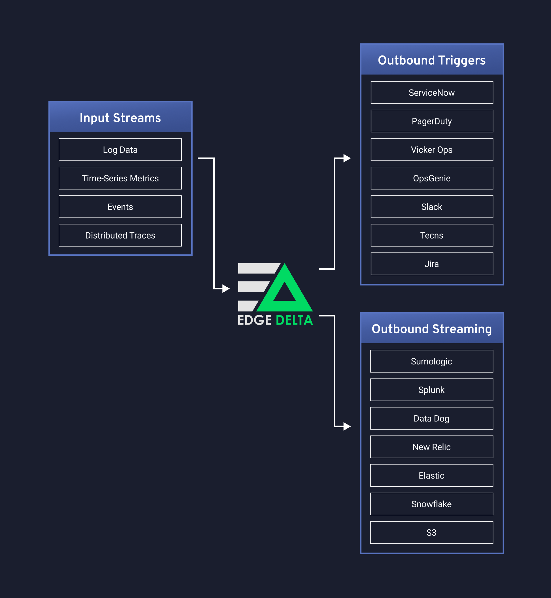
Edge Delta is a stream processing platform for observability, predicting, and detecting anomalies in operational and security data.

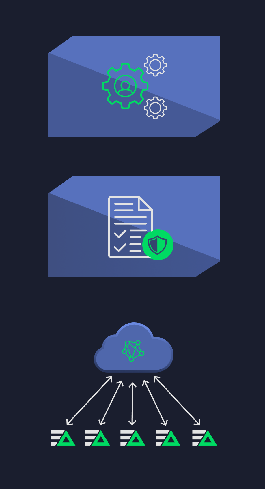
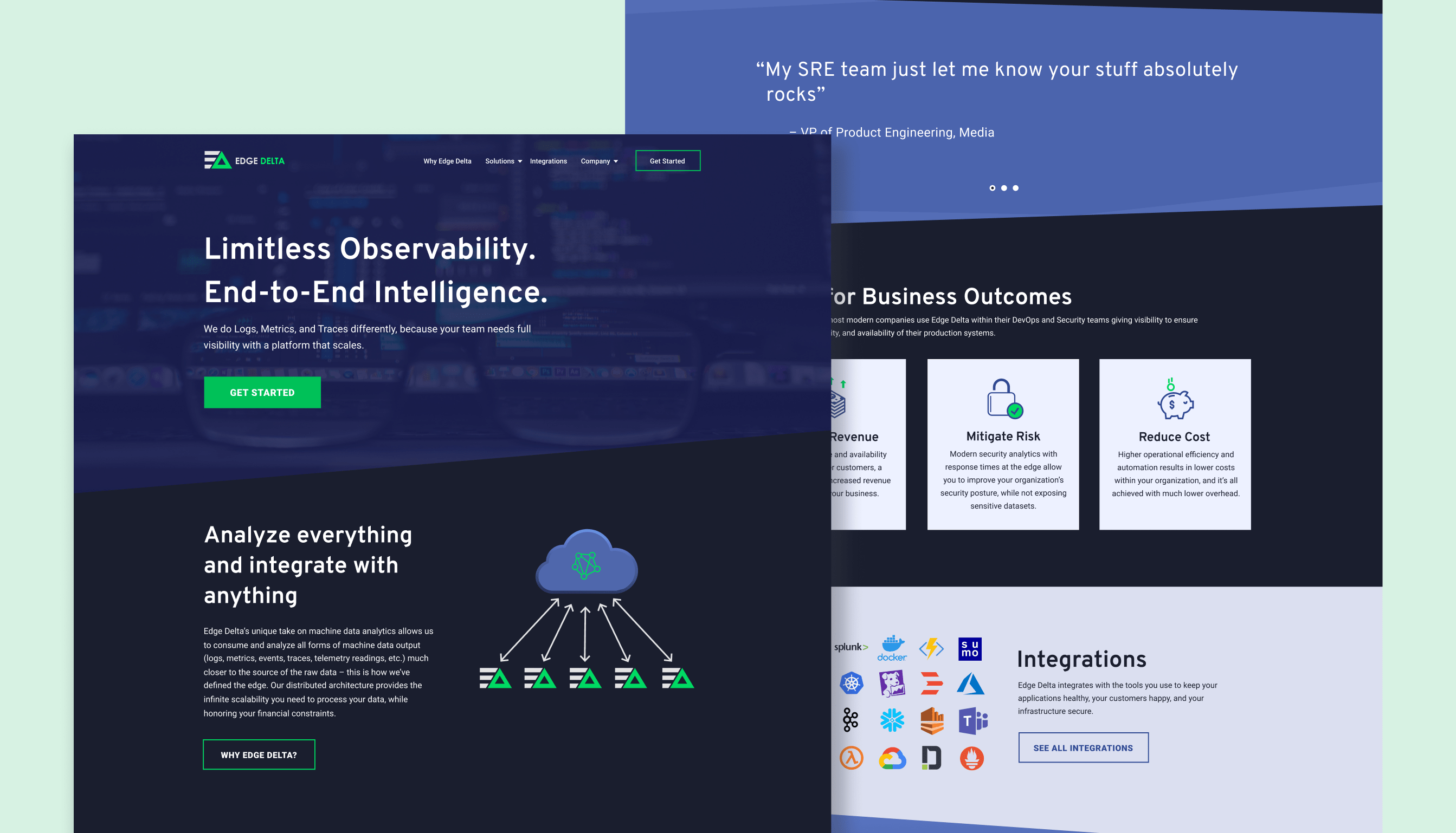
When I first started working with Edge Delta, they were just getting started and only had a logo. They didn't have any branding, let alone a website. Edge Delta hired me to design their website, a style guide for their brand, and icons + graphics to place inside their website and use in marketing materials. 

After some time had passed, they reached back out to me to revisit and elaborate on the original one page website, where I created a sitemap, consulted on content strategy, copyedited, and created more icons and graphics.

Because of their amazing product and having a nice website to show off to potential investors, Edge Delta raised $15M in their Series A round of funding.


Web Design & Evolution


The first website design was single page, simply because the company was so new and there wasn't a lot of content to showcase in the beginning. This web page essentially acted as a business card for the sales team, for potential investors, and general networking.


Image
Image
Image

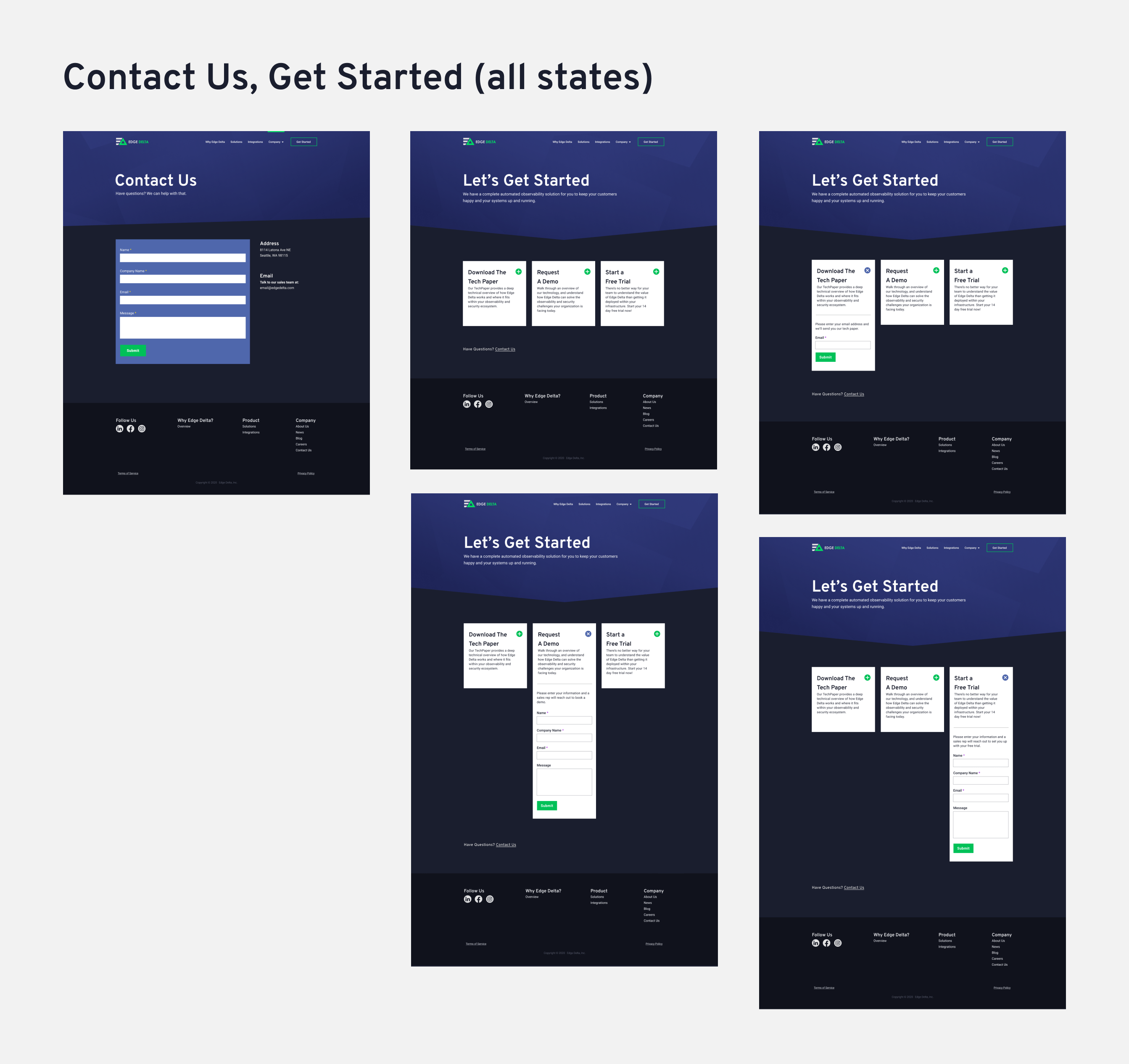
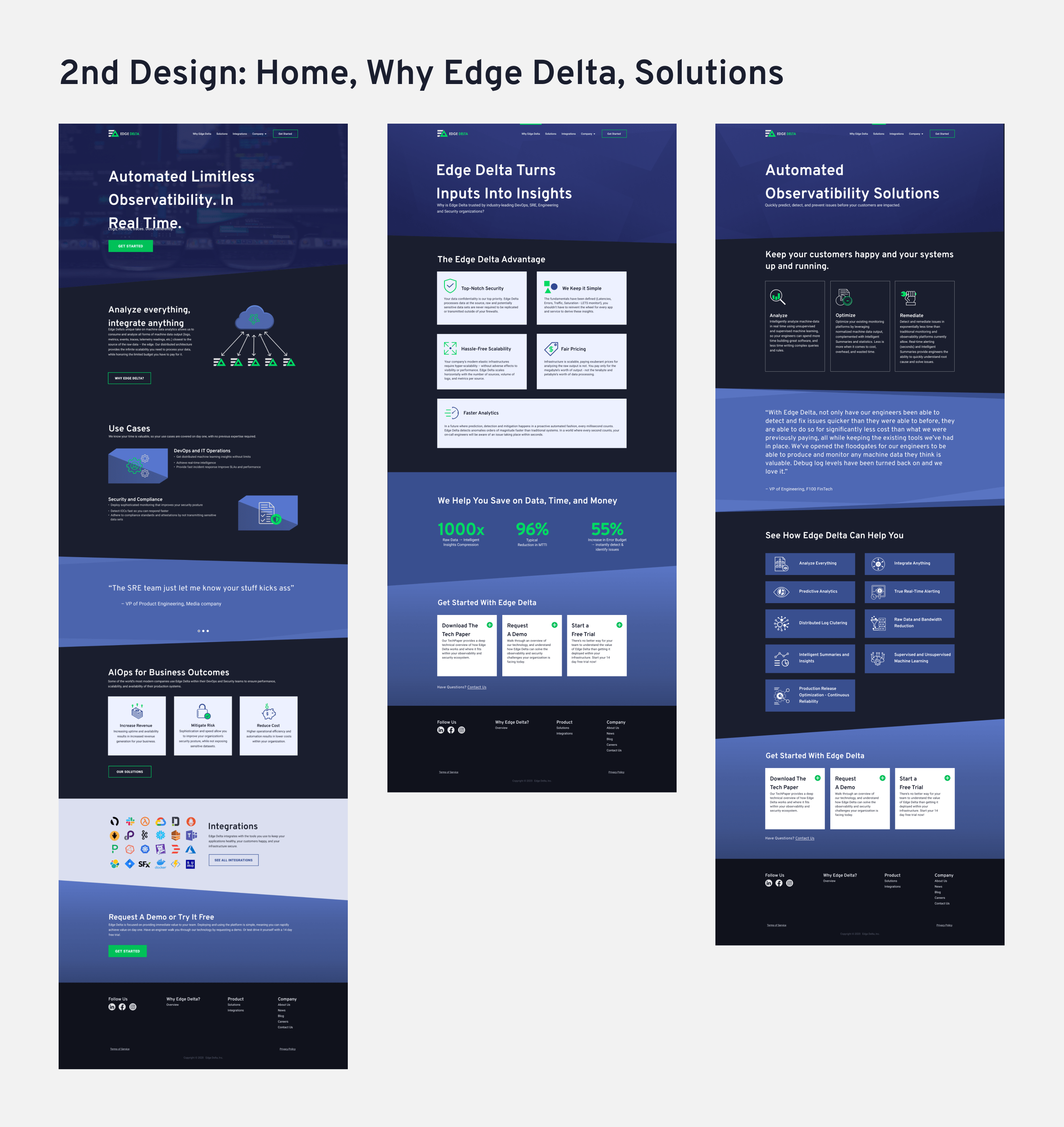
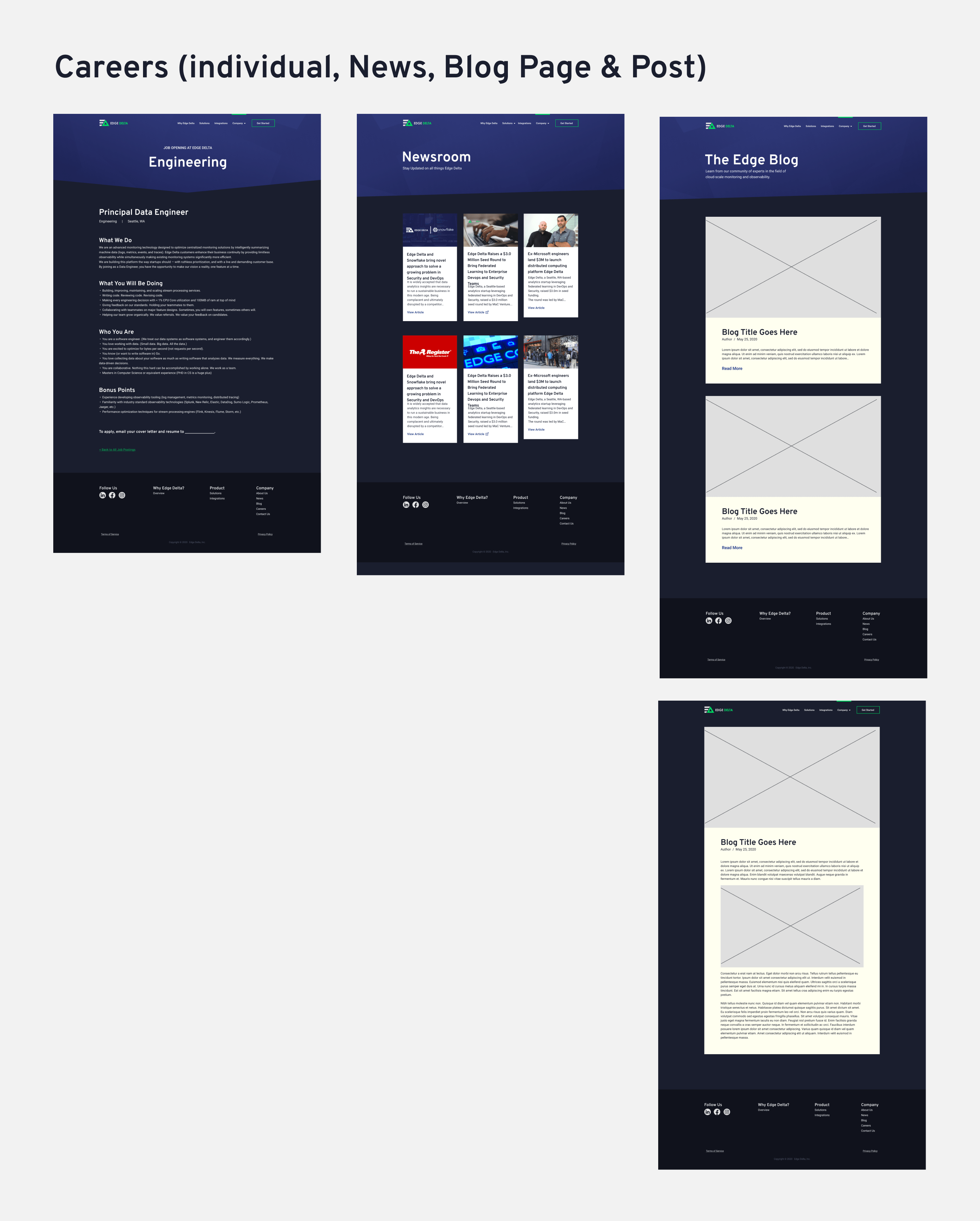
As time went on, the product and company matured. Edge Delta had a lot more content that they needed to show, so they reached out for a reworking of their website. I worked directly with their head of marketing and provided content strategy, website design, and created more icons and graphics. Below is the final result.
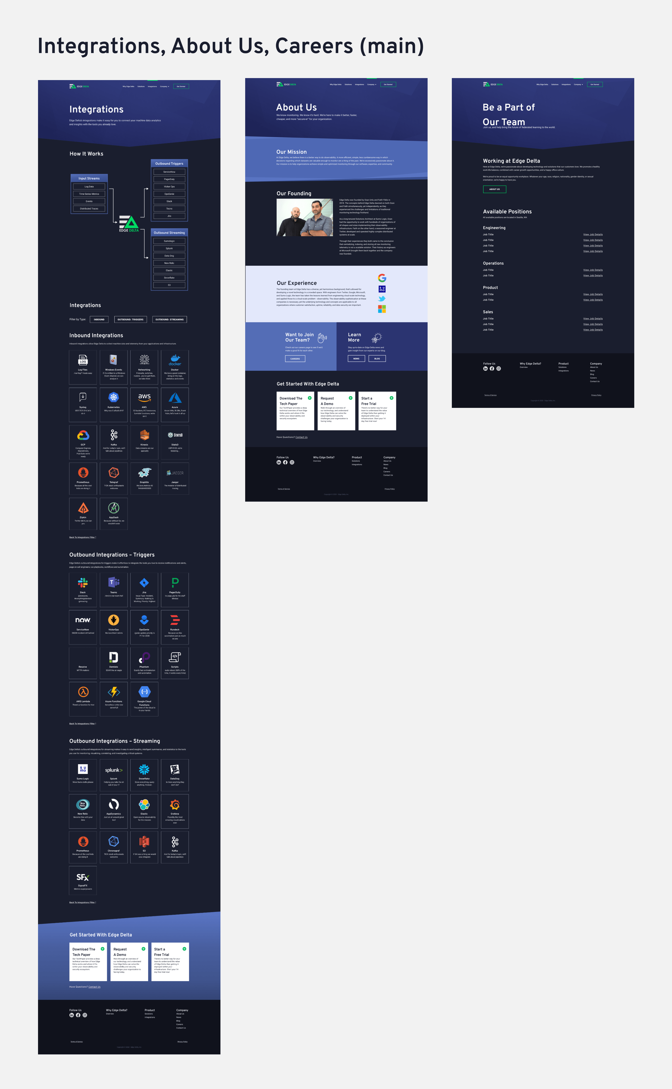
ImageImage
ImageImage

Site Functionality


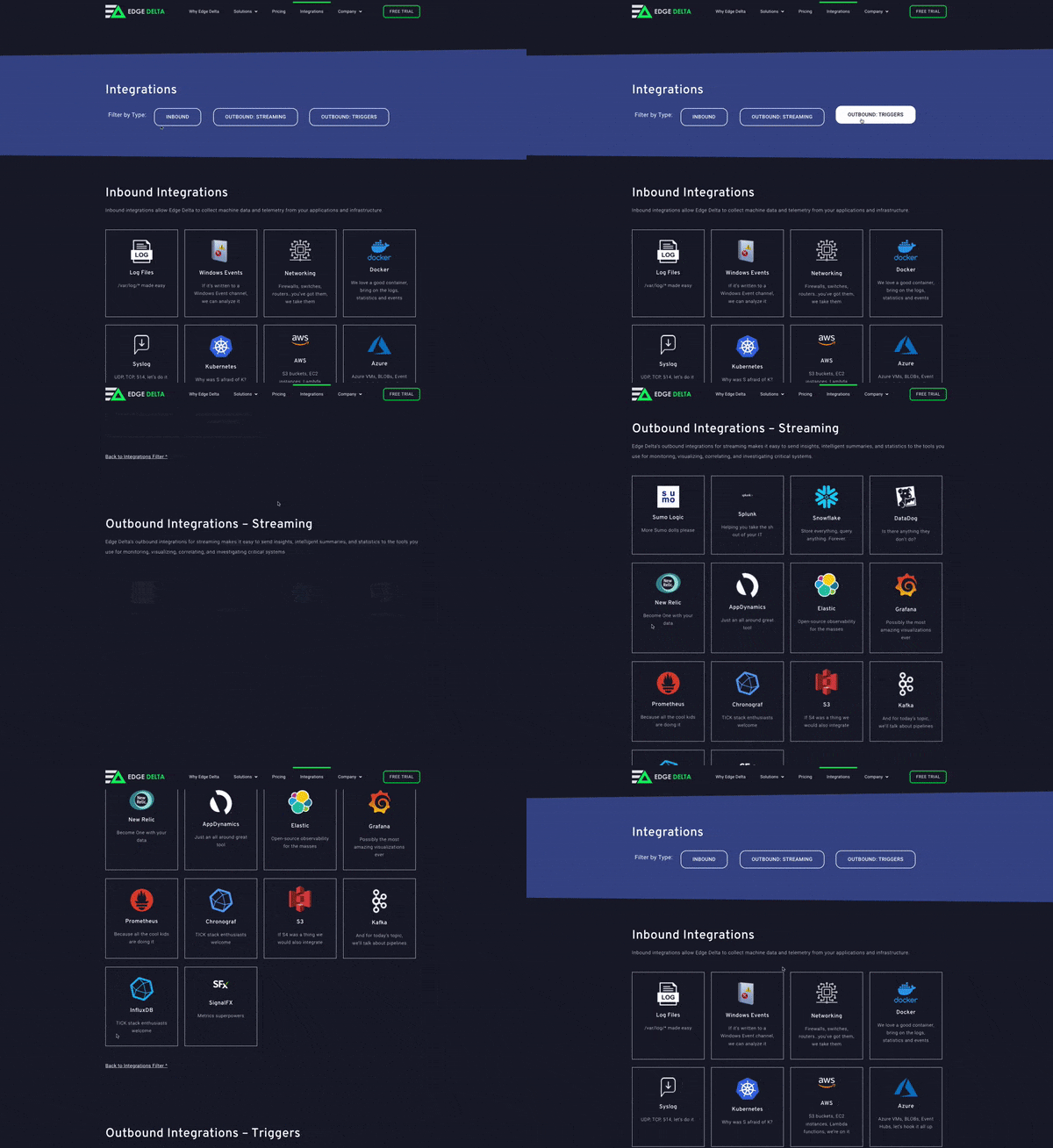
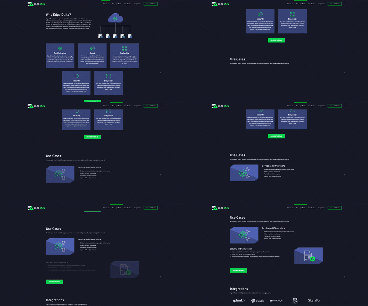
In both the first and second iterations, I added subtle animated transitions between sections. I also made sure that if something was expandable that a smooth transition would happen in that interaction for the user. This gave the site a more mature and modern look and feel. 
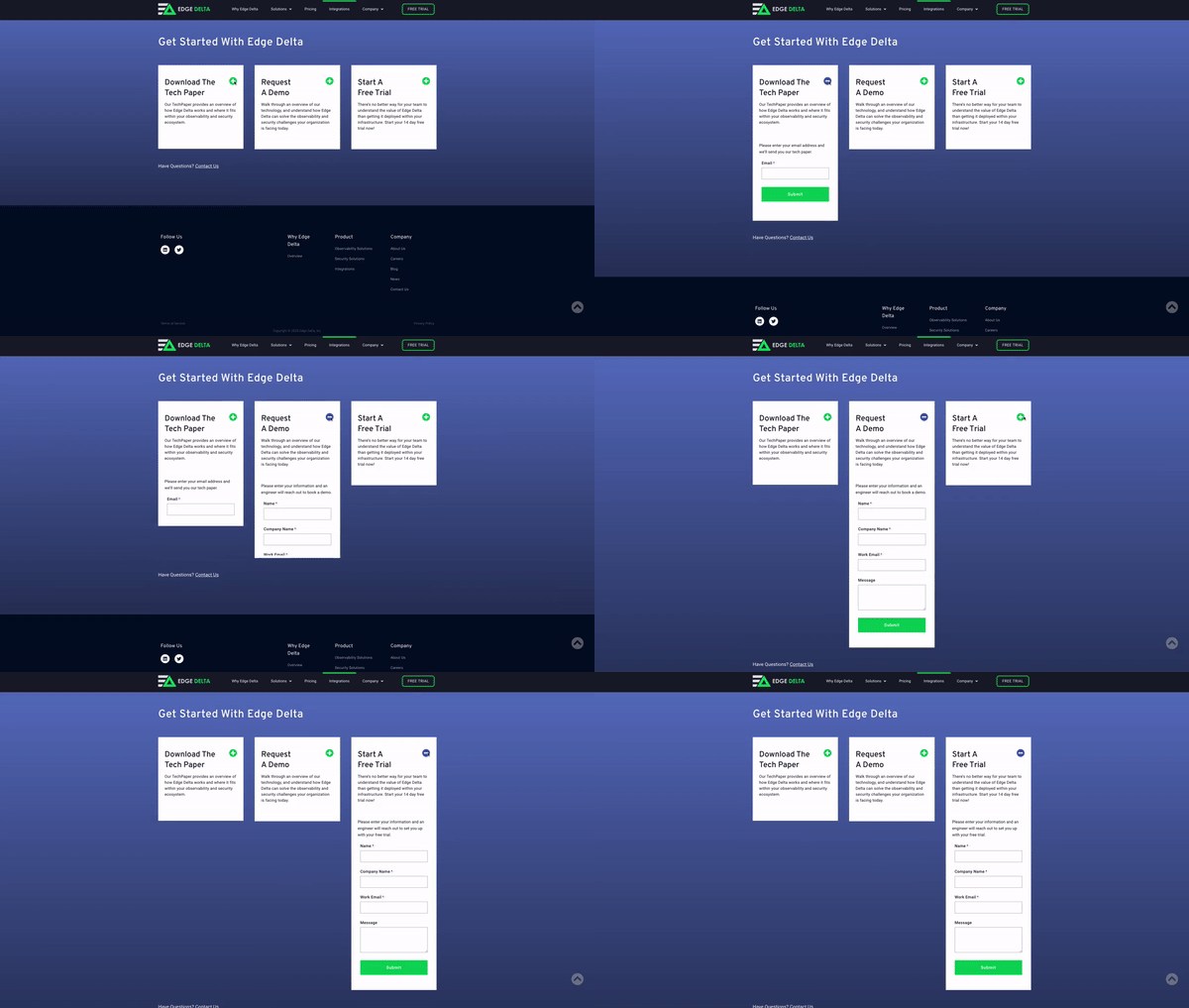

Image
Image
Image
Image

Branding


Other than a logo, Edge Delta had no branding or visual language associated to its brand. I sat down with the founder and CEO to talk specifics about his company and what he envisioned for it. He wanted the brand to feel streamlined, technical, and modern. After I went to the drawing board, we decided that a dark color scheme with angled font headings and line icons was the right direction to take Edge Delta's brand. I came up with a few color schemes, but it was agreed that the deep purple evoked a sense of modernism and creativity. It also paired very nicely with the electric green and dark background.


Icons


Image

Graphics


Image
Image

Want to Work Together?

Fantastic! Hit the button below to get started.