Role: Senior Product Designer
Services: Product Design – creating a new-and-improved version of their existing embedded menu offering, made small amendments to their Finder experience on Leafly.com, and added components to their design system.
Leafly is the world’s most trusted destination to discover cannabis products and order them from legal, licensed retailers. More than 125 million people visit Leafly each year to learn more about cannabis and order online with local businesses.
The company works with businesses to help boost awareness and searchability, as well as create online ordering platforms for them on Leafly.com and provides an embeddable menu for dispensaries websites.
Leafly also works directly with consumers in order to help them find dispensaries, learn about cannabis in all forms, and sells dispensary’s products through their site.
I had the privilege to work on revamping their website menu option they provide to dispensaries. Businesses use Leafly’s menu manager service to input their products and pricing. As a result, it appears in the embedded menu on the dispensary’s website.
I worked solely on the frontend part of that experience – the embeddable menu. It was an interesting B2B2C experience. Not only did we need to cater to the requests of dispensaries’ wants and needs for an embeddable menu, but we also had to ensure that it was a top-notch eCommerce experience for their customers.
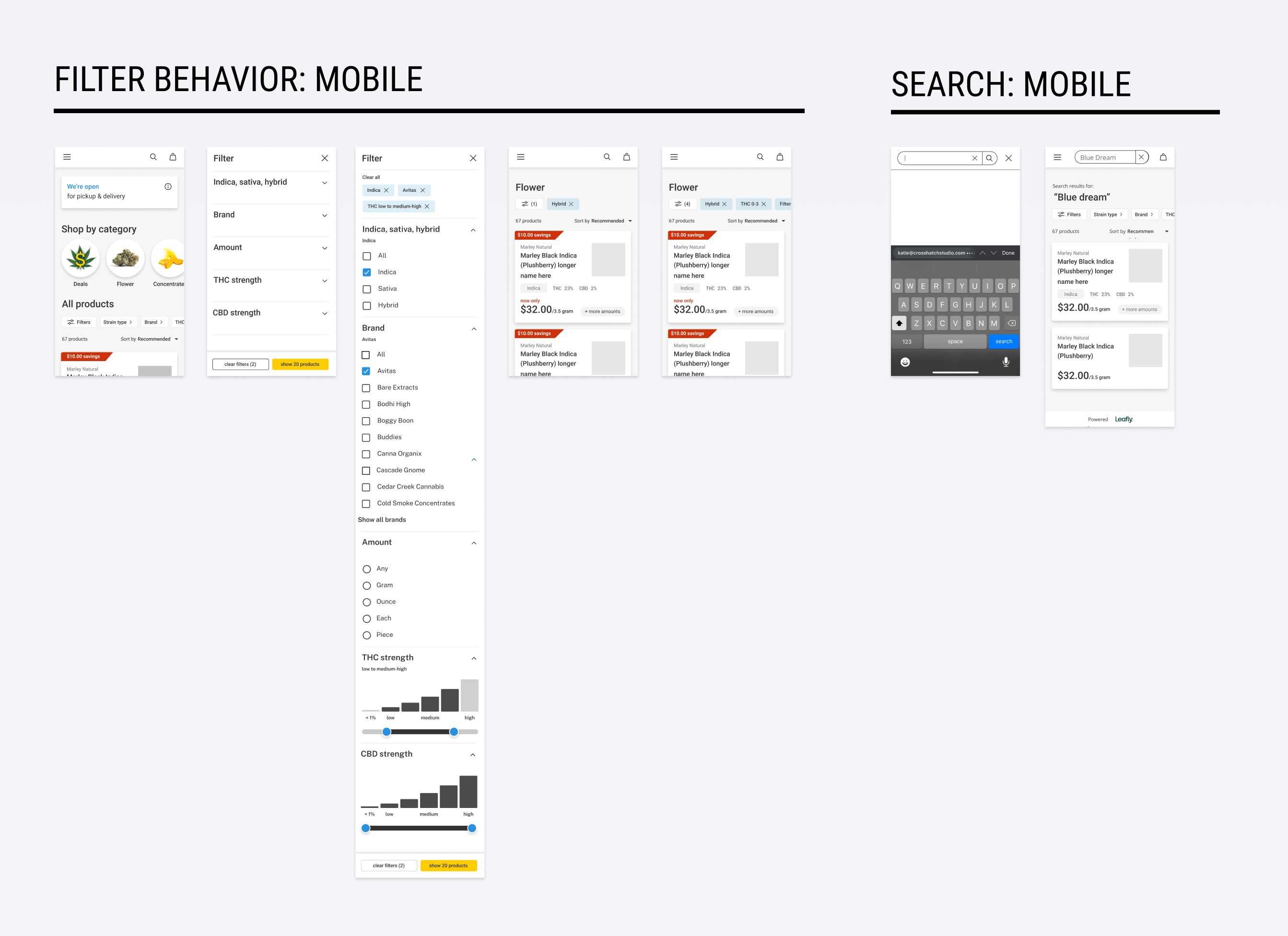
The Menu
More and more dispensaries were starting to use other platforms to sell their products through their sites. Leafly needed to make some changes in order to get more dispensaries to adopt their embeddable menu offering.
My PM, and members of the sales team, and I met and interviewed several dispensaries – some who were using the current embeddable menu and others who were not using it to understand their pain points.
From the last time the embedded menu was updated, new insights had emerged on customer behavior on leafly.com’s menus. Amendments had been made on leafly.com, but not in the embedded menu experience.
I also conducted a competitive analysis and performed my own research through The Baymard Institute, Nielson Norman Group, and articles from the UX collective.
Due to technical limitations and time constraints, this is what the dev team and I delivered with the new embedded menu:
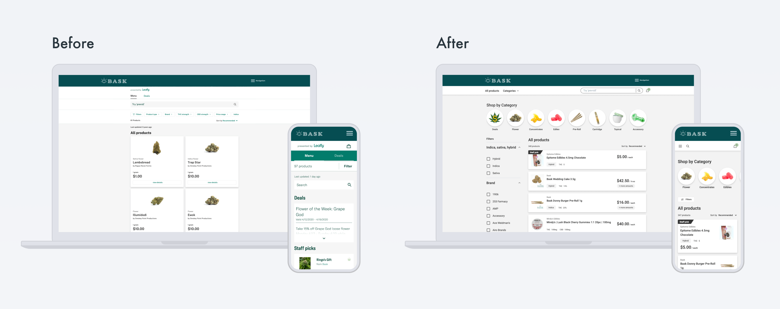
Created a less Leafly branded look and allowed for customization in the menu. Dispensaries had a problem with the overall styling of the menu – they didn’t like that it was basically the Leafly site menu pasted into their site and they couldn’t customize any colors in the UI. They wanted their brand reflected in their site’s menu.
Created a getting started document for dispensaries. The embedding process was difficult for some to implement. The PM, the dev team, and I created a document that helped guide them through setting up their embedded menu successfully, as well as design best practices in regards to custom color choices.
Made the menu more user friendly by leveraging leafly.com’s current menu designs as well as my own research.
Below is how I broke up the user experience for the dev team's sprints.
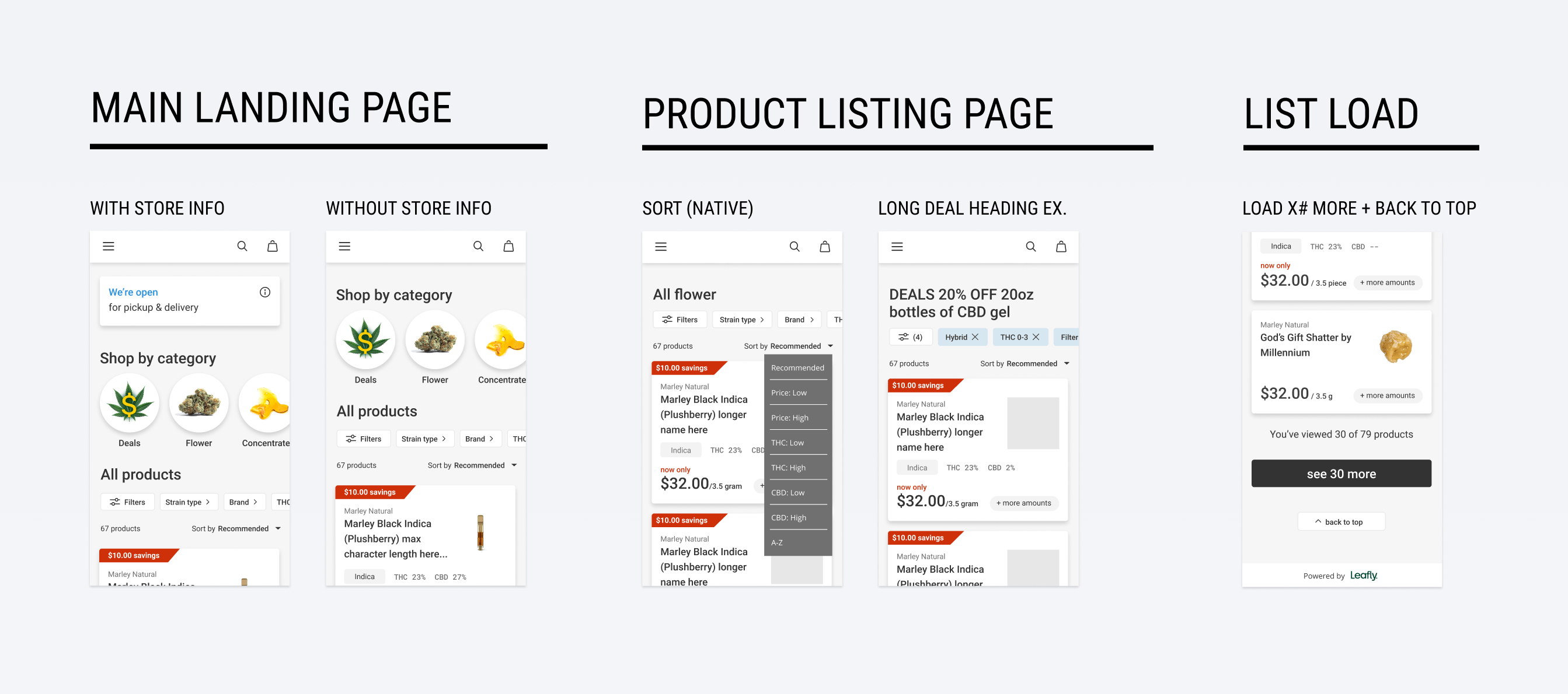
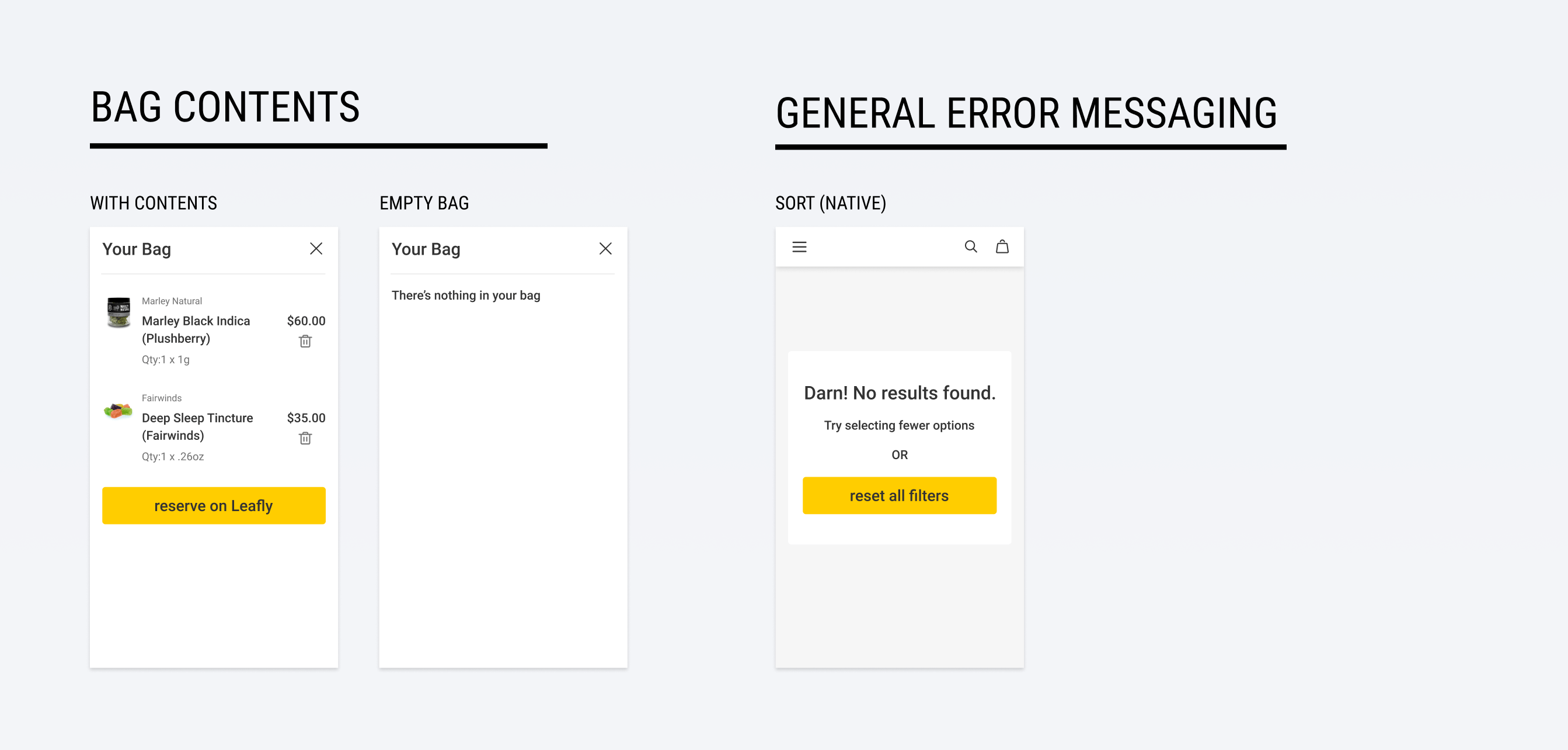
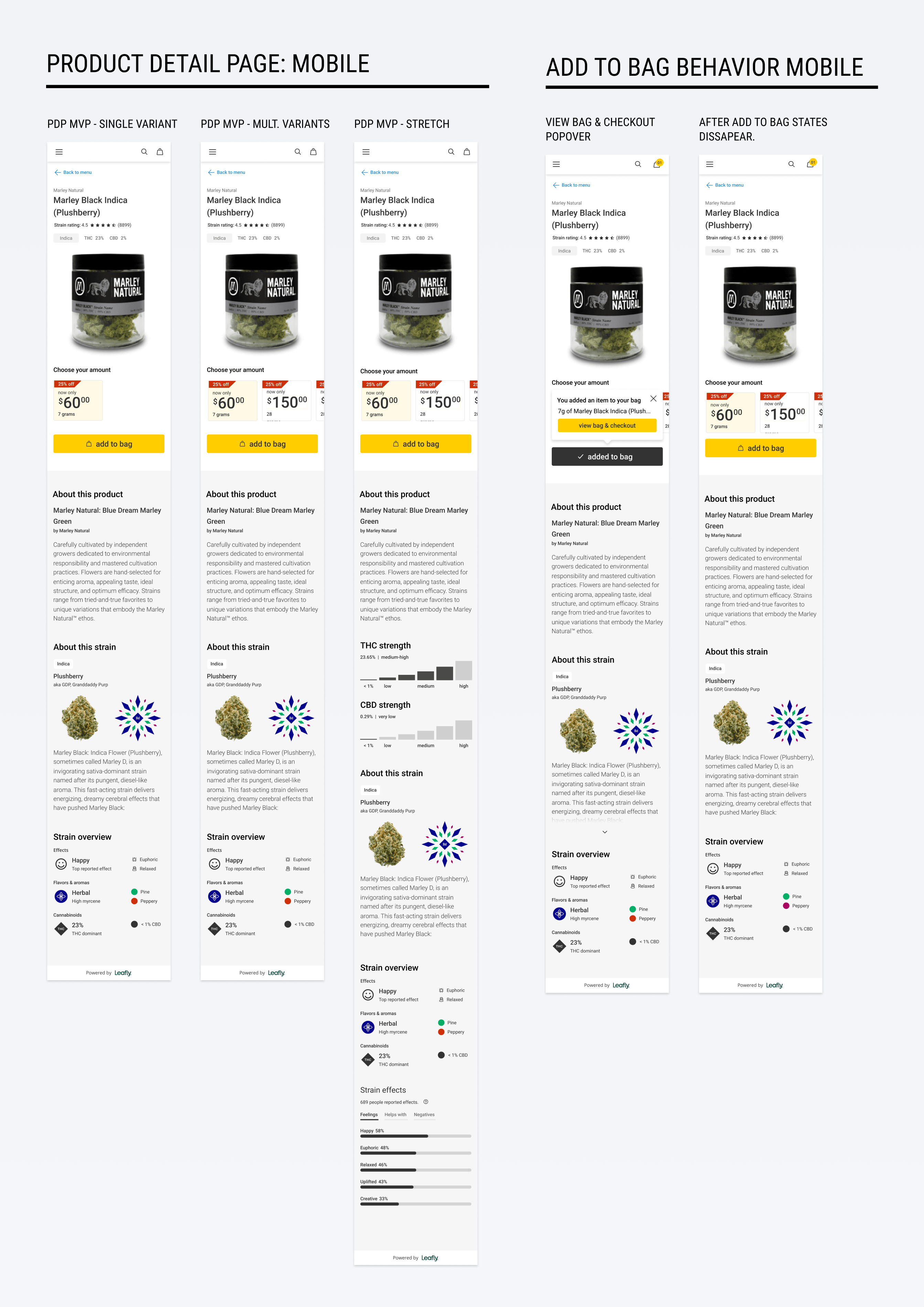
Functionality & Flows
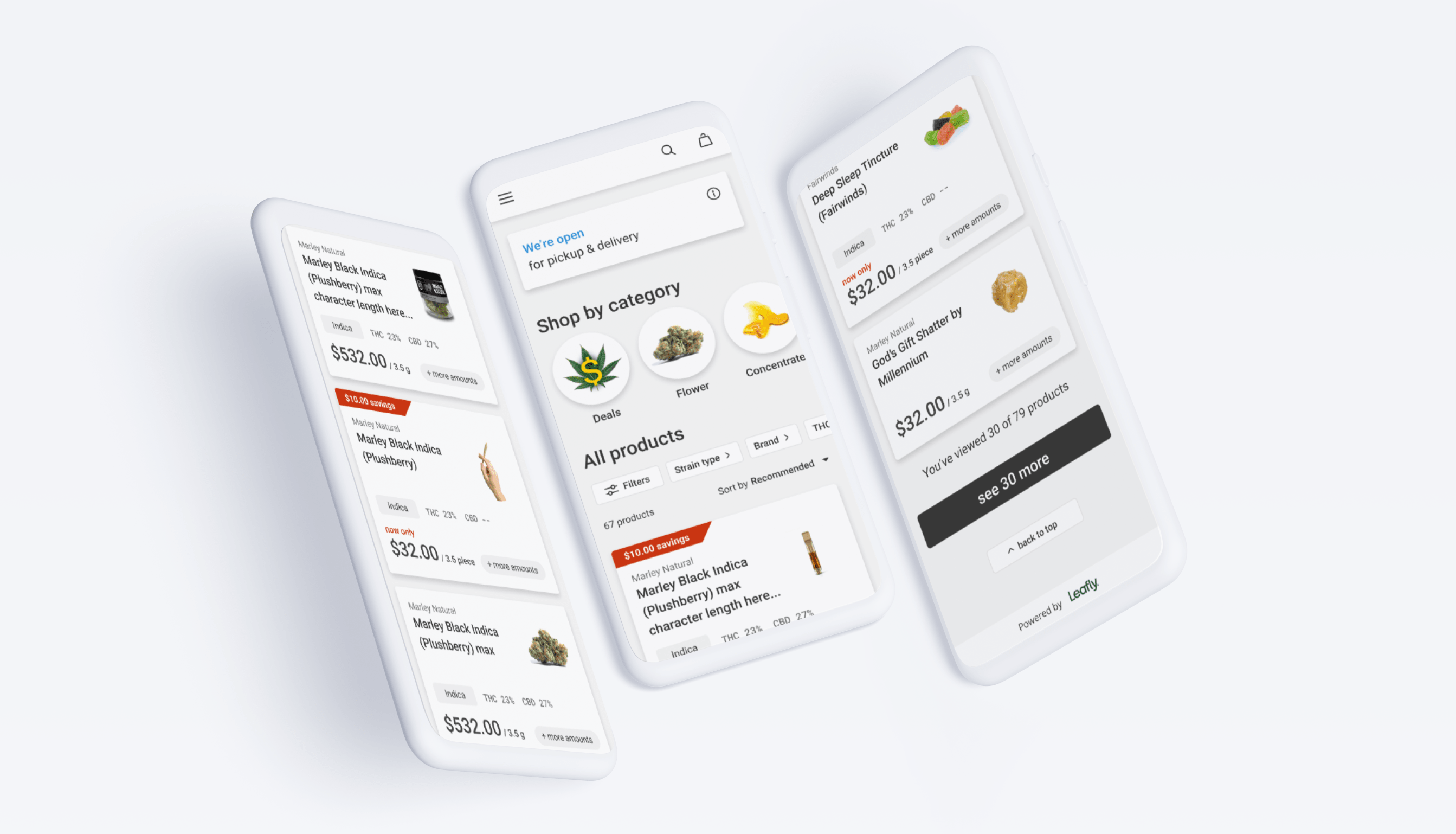
Below, you can see clips of various flows I designed for the embedded menu.
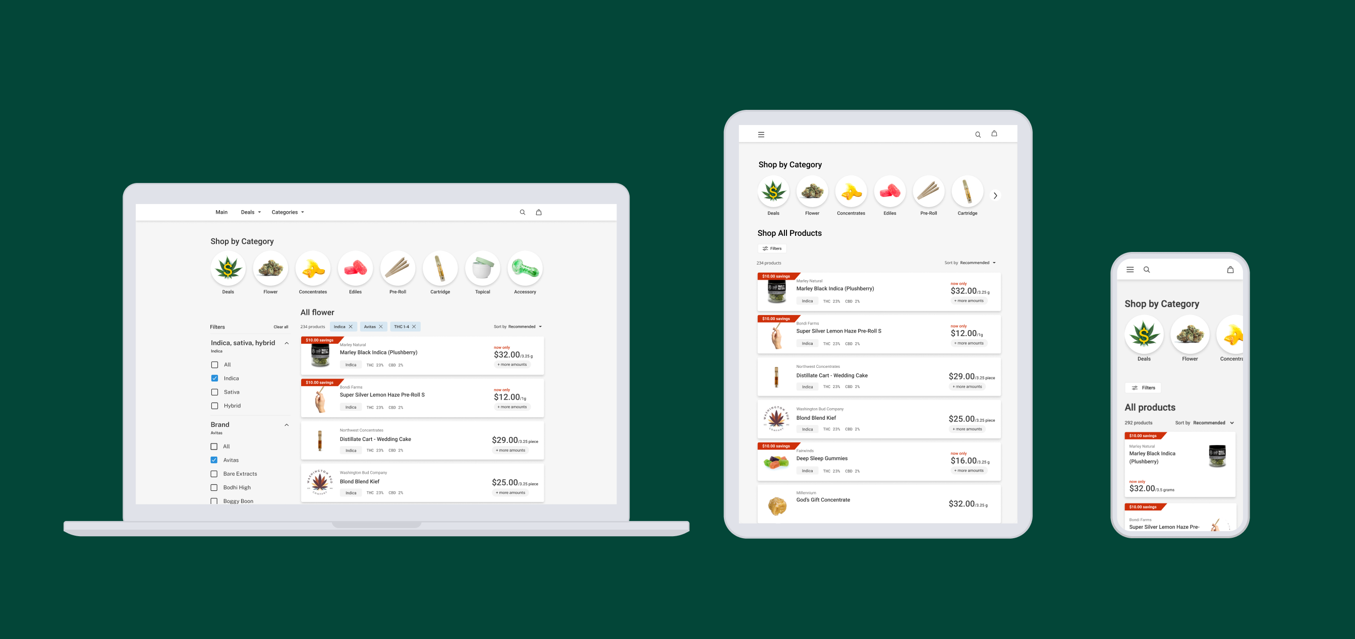
Components
Some select deliverables I made for the dev team.
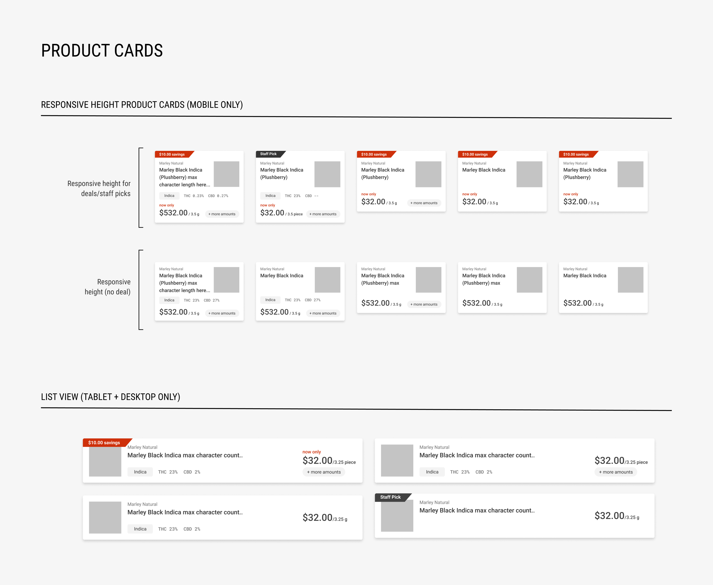
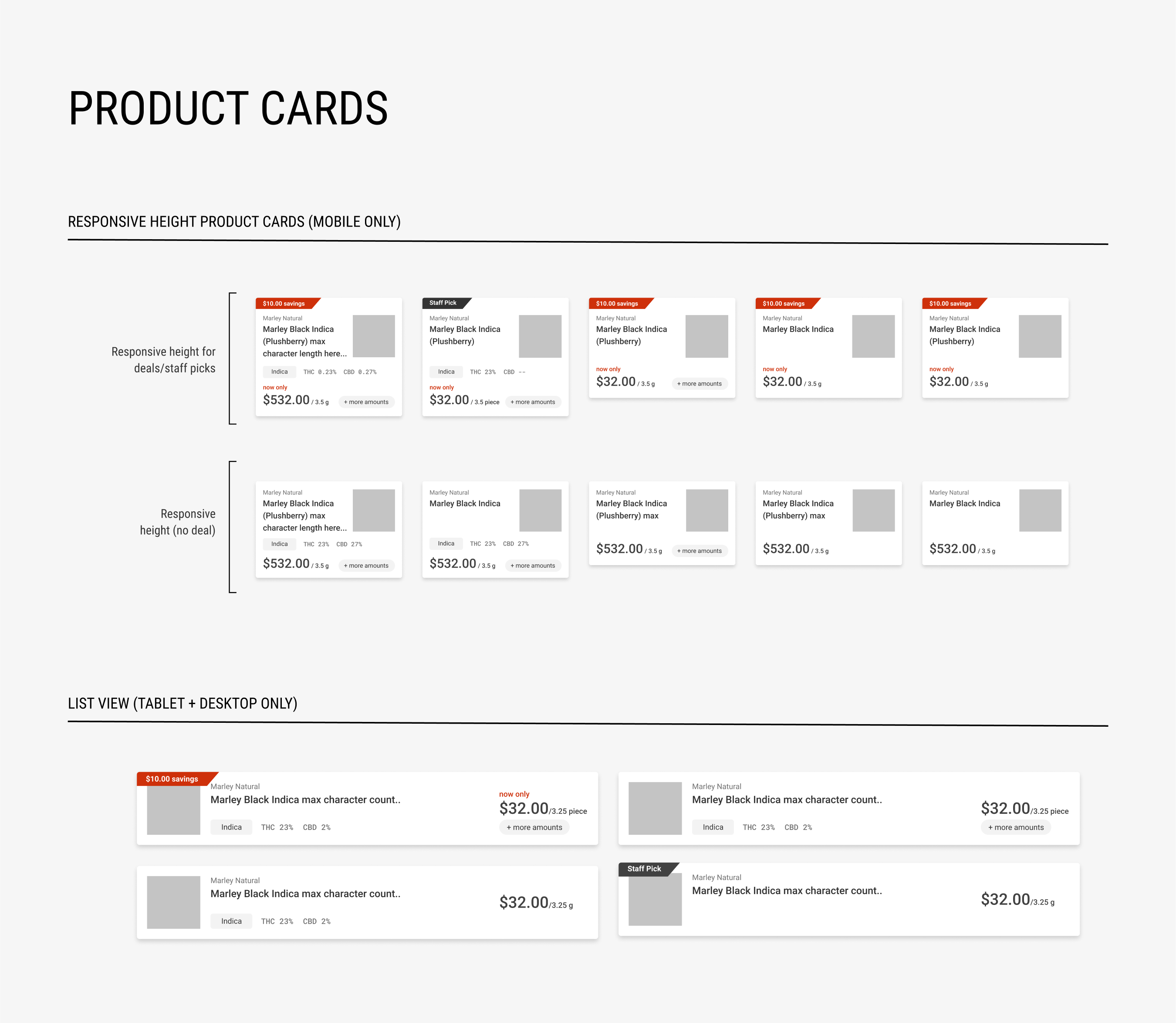
These product cards are a deviation from Leafly's cards. This direction was made based off of my research through The Baymard Institute. When I presented these designs to the greater design team, it was agreed on to use the new product cards in the embedded menu to test their performance in comparison to the cards that are currently being used on Leafly's site.
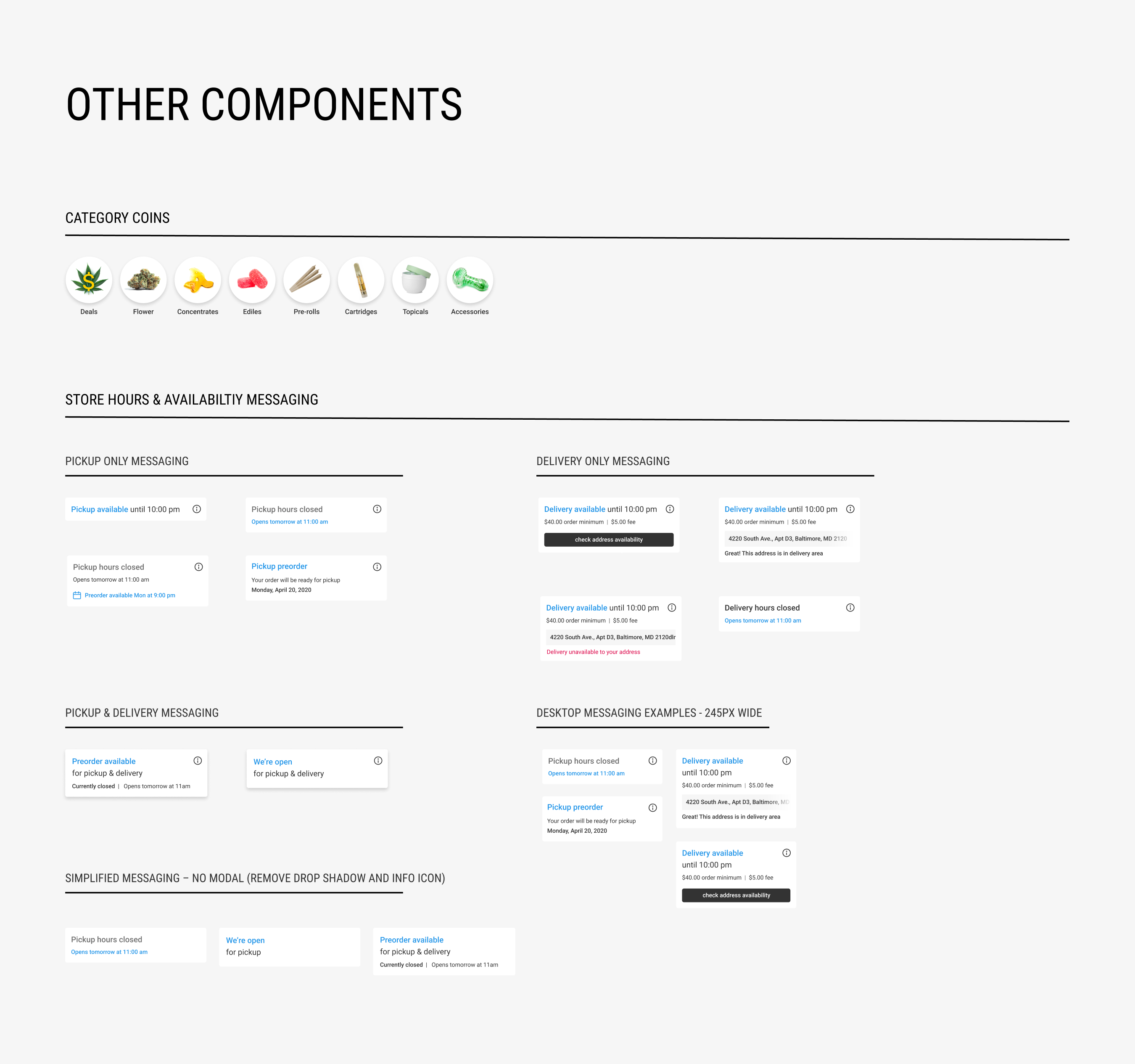
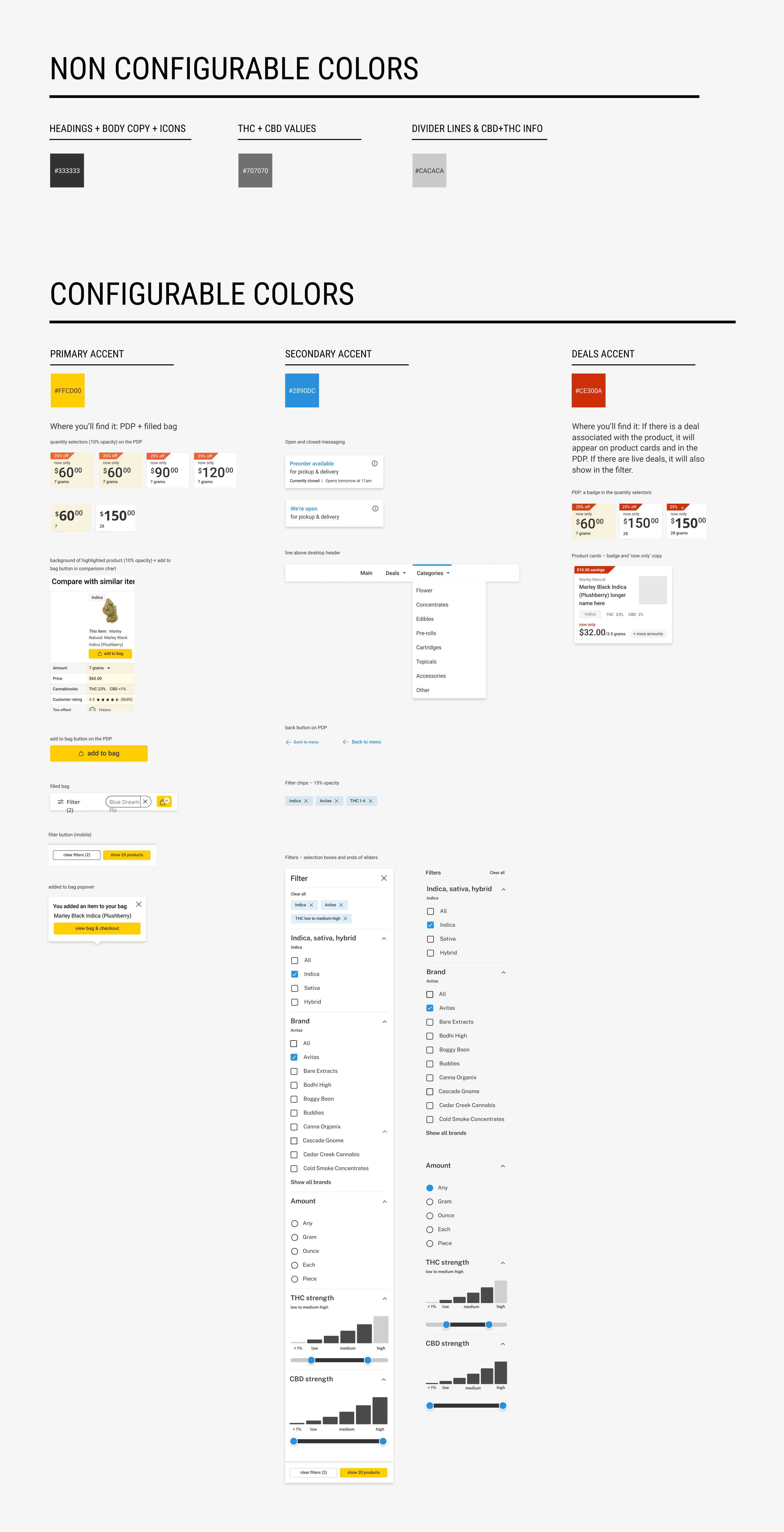
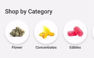
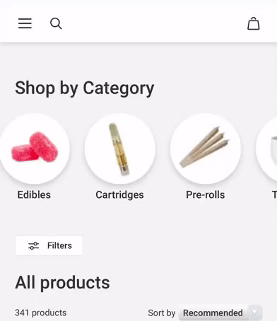
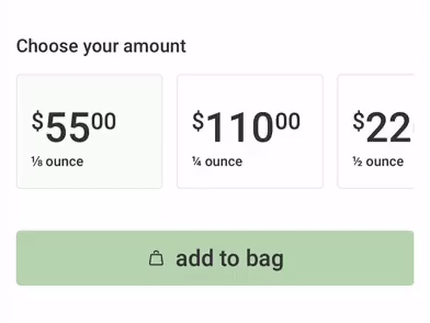
The "category coins" were taken from Leafly.com's existing shopping experience. I ended up working with the creative team for them to update the imagery and create a new image for the "deals" coin since that didn't exist in Leafly's website menu. The store hours component was a deviation from Leafly's website menu. It didn't make it into the first launch of the menu due to timing constraints. I made the colors section for devs to reference exactly what in the menu should be customizable and what the default colors were. A more simple version of this made it into the getting started document for dispensaries to reference.
Want to Work Together?
Fantastic! Hit the button below to get started.