Role: Product Designer
Services: Product Design – designing onboarding personalization flows for potential and existing clients, consultation, website design for MessageYes and its clients, branding, and marketing assets.
After having success with their text message-based B2C store, The Edit, the CEO of MessageYes started working to secure its next round of funding. As he traveled and spoke with potential investors, one thing was made very clear – most were interested in using MessageYes as a platform for companies they were involved with. Leadership decided to pivot the business to a B2B model and provide a white label service, using their ML personalization algorithms, text messaged-based product recommendations, and customer success agents.
As the designer, it was my job to adapt and create webpage designs, user flows, and prototypes that fit the business aesthetic and industry of whatever company we were pitching to, as well as the companies that had signed with us. I assisted with the onboarding of clients so they were aware of copy and image best practices for SMS and MMS messaging. I was also responsible for creating sales and marketing materials.
Some of the brands we worked with were Disney, Universal Music Group, Selena Gomez, Stadium Goods, Fanjoy, & Porch.
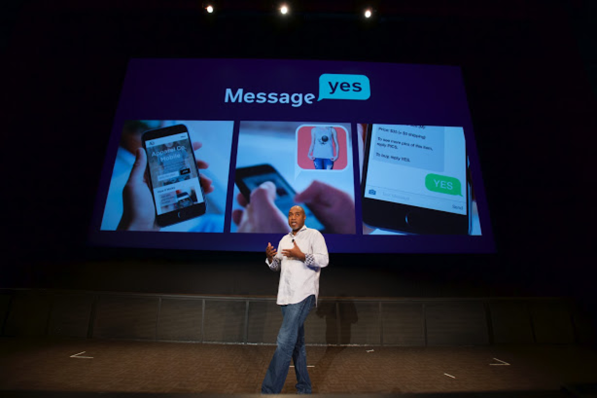
MessageYes went on to be adopted into the Disney Accelerator Program. Because of this new partnership, MessageYes' CEO needed to speak at their Demo Day, which included all of the startups Disney had included in their program. I worked with our CEO and Disney consultants to create the Demo Day presentation. It aired to a worldwide audience on ABC News.
Nordstrom acquired MessageYes' team and technology in March 2018.
Below, you'll find some select works from my MessageYes days: Business Model UX Flows, Universal Music Group, Selena Gomez, Star Wars (Disney), and MessageYes company work.
Catering to Different Business Models
MessageYes realized that their technology could fit several business models and countless industries. In order to showcase this, I worked with the CEO and other members of the team to create user flows for various business models. I created videos to showcase 6 different models: VIP experiences, subscription services, apparel, consumables (coffee, wine, food, etc.), digital content (like movie rentals), consumer goods (ie: makeup, other tangible goods). Below are 4 of those experiences.
Universal Music Group
Universal Music Group (UMG) learned about The Edit's success and decided they wanted to buy The Edit and use MessageYes' new white label platform. Since it was at the beginning of our business pivot, it was a great time to unload the digital store so our dev team could focus on client work instead of maintaining our own store.
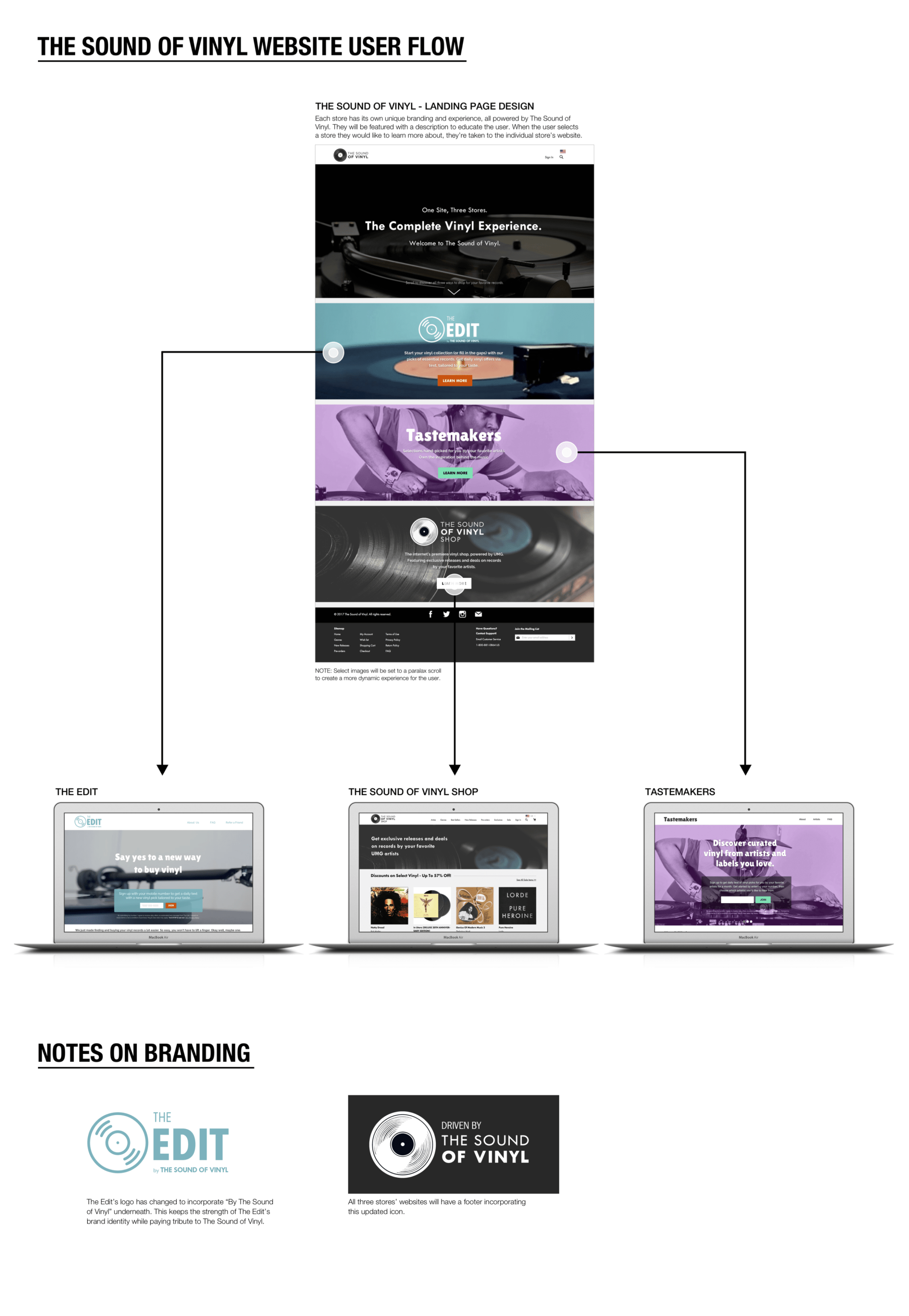
When UMG & MessageYes first started to collaborate, they originally thought about creating three individual vinyl stores using MessageYes' platform. They would all fall under the name, 'The Sound of Vinyl'. The three stores were: 1) The Edit by The Sound of Vinyl, where they could keep existing customers and expand on them; 2) Tastemakers, where you could sign up on an individual UMG artist's website. That artist would then send recommended albums that they liked; and 3) The Sound of Vinyl, where users could sign up for exclusive releases and deals on UMG artists' records.
I created user flows and webpage designs for this vision, making sure that they would all look and feel like different experiences that also worked together.
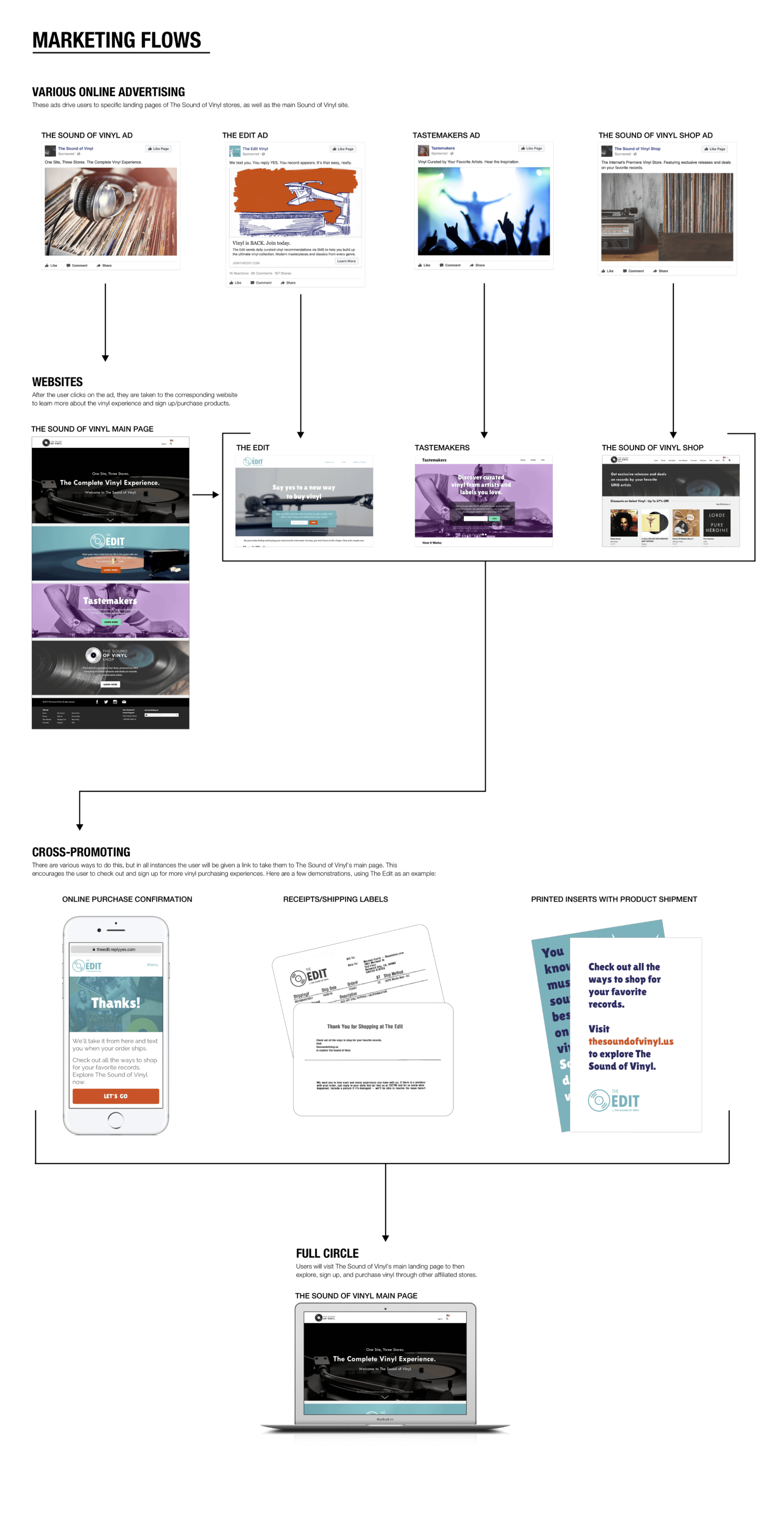
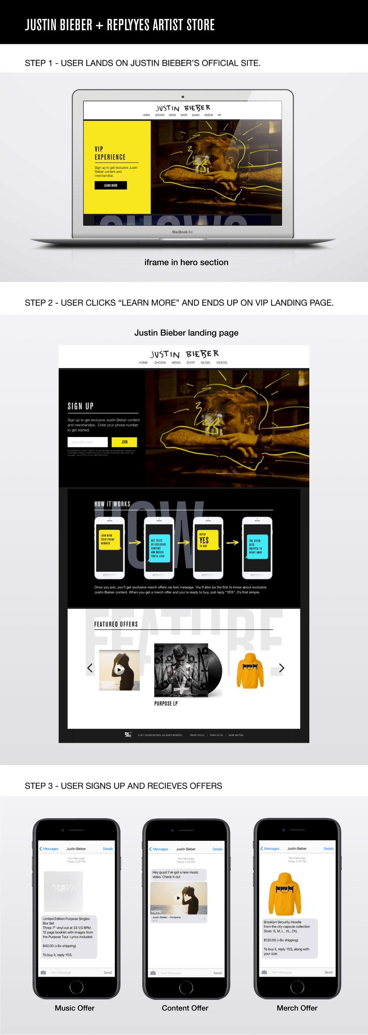
This idea ultimately evolved into UMG creating The Sound of Vinyl and slowly migrating The Edit's customer base and sunsetting that store. They also decided that instead of creating a Tastemakers experience, they would encourage certain UMG artists to create merchandise text message-based storefronts. I designed all of the landing pages and basic user flows for UMG artists, such as Justin Bieber, Chance The Rapper, Machine Gun Kelly, Good Music, Don Was, Steven Tyler, and more.
You'll notice that all of the web pages are identical in the general content sections. The How It Works section is also generally the same. This was intentional. While we were fitting these landing pages to the artists' brand, we were also incorporating MessageYes' design elements. This helped us retain consistency among experiences for our developers, but also created a format that might be recognizable to businesses that UMG artists were using MessageYes. Below are some select artist designs.


Selena Gomez
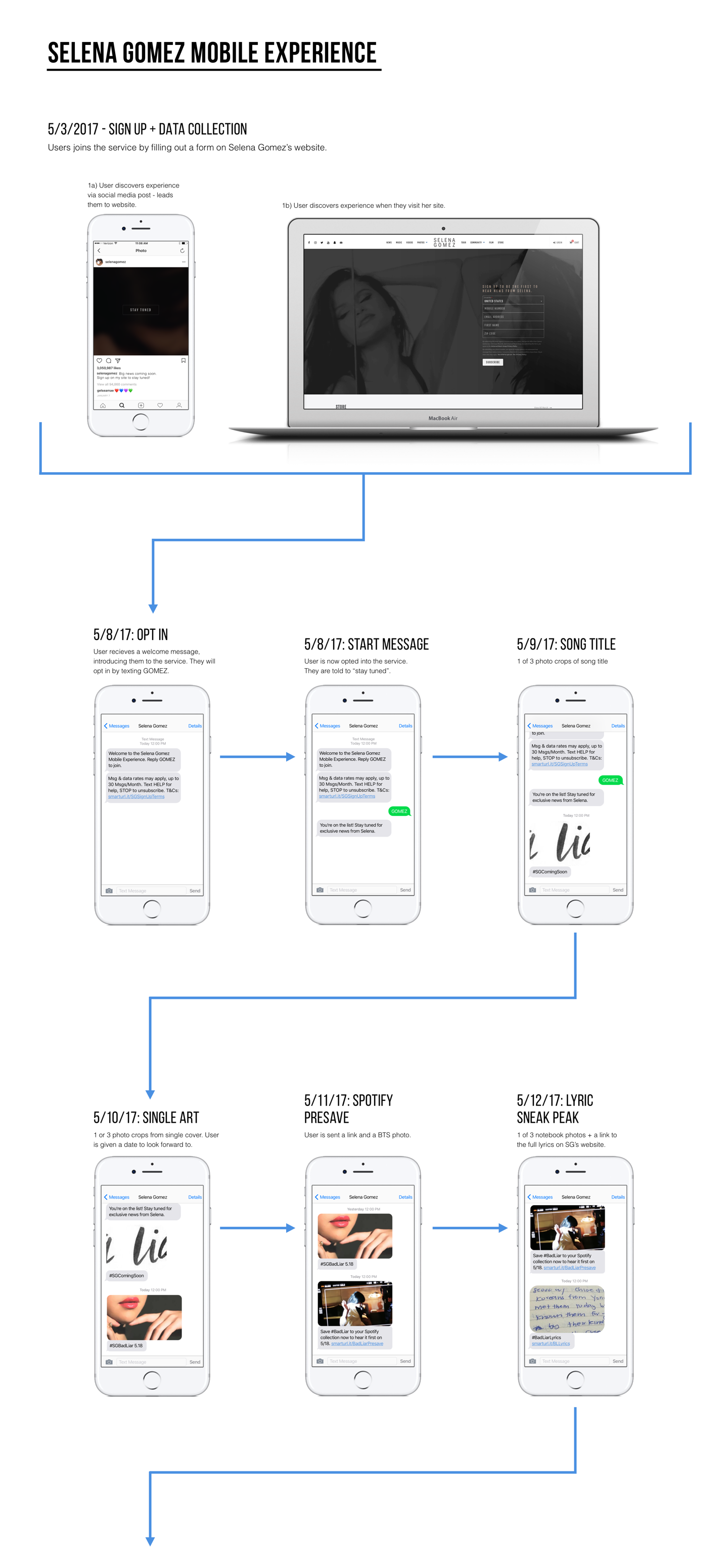
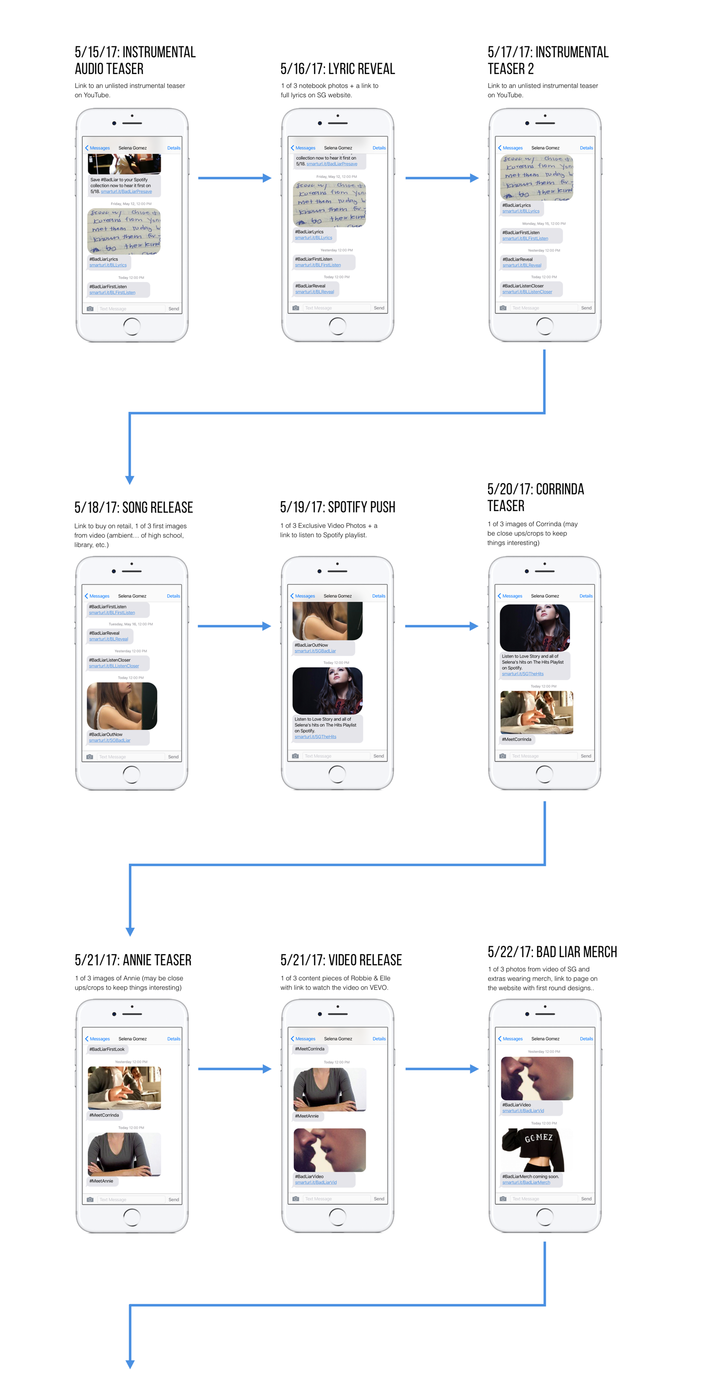
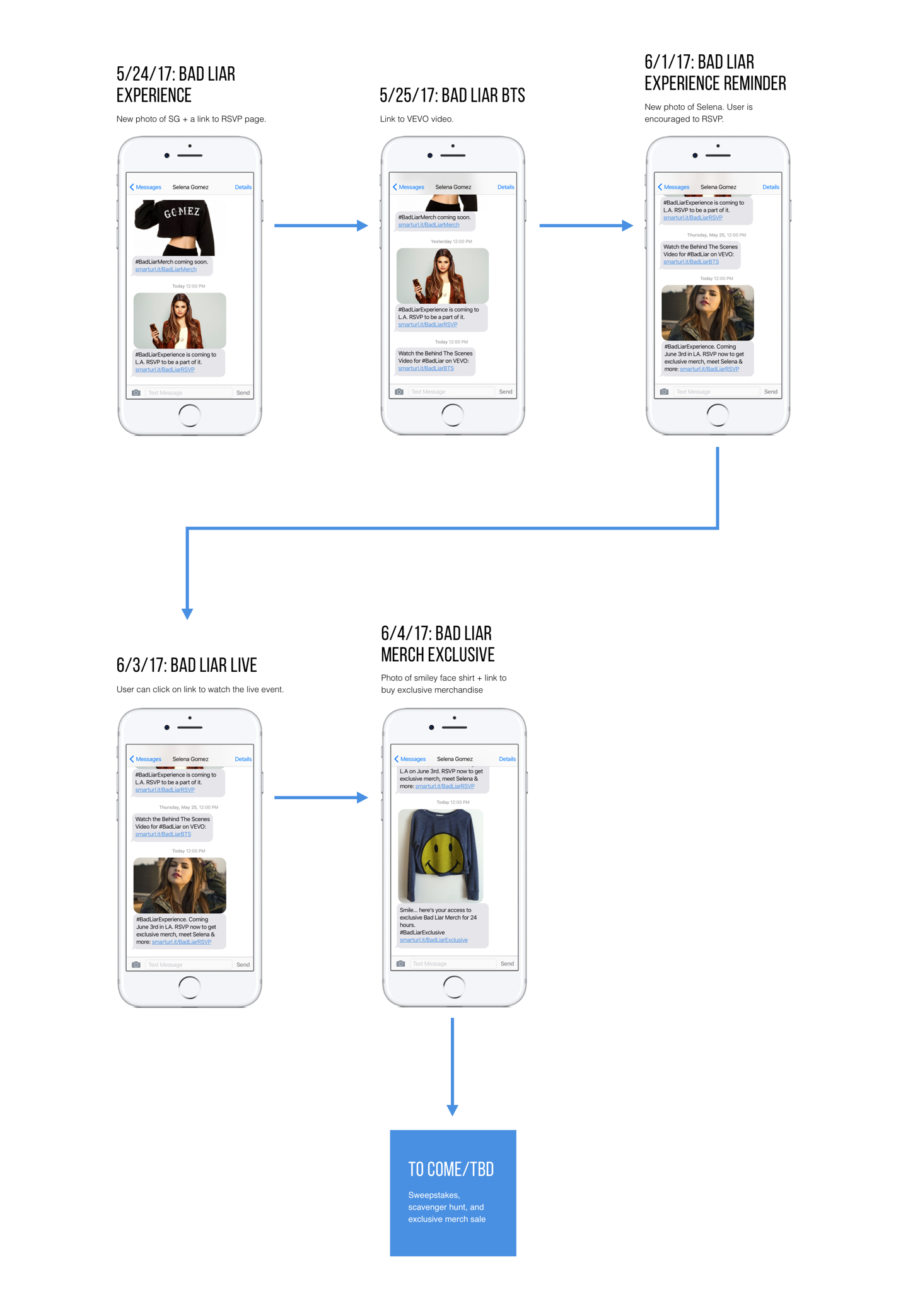
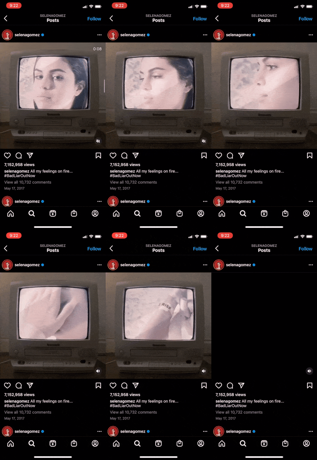
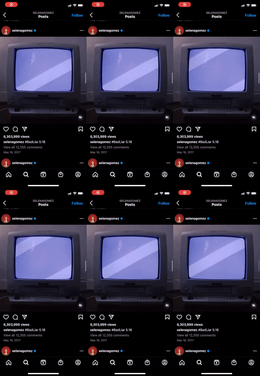
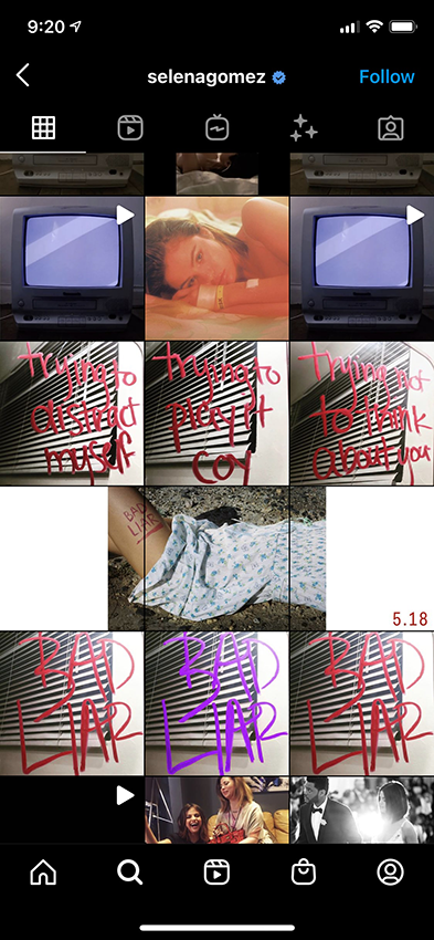
Selena Gomez, a UMG artist, wanted to do something a little different that just use MessageYes to sell her merch. She wanted to engage more with her fan base and decided to use a text message-based channel as a teaser. This new text message channel was considered a VIP fan experience. Through it, she slowly fed her fans small clues throughout this channel, as well as her social media channels about her new single that was coming out. Those who signed up for the text messaging service were given exclusive sneak peeks to her new single, as well as first dibs on new merchandise.
I provided consultation to Selena Gomez's media manager for best user experience practices – such as messaging copy, the length of the copy, forms of media, and hero image layout.
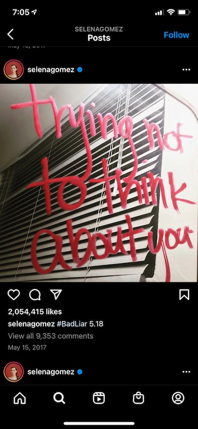
After many consulting sessions, I created the user flow below. These are not the actual images and copy that was used, but a portrayal of the content from the music video that hadn't yet been created. I've included select images and gifs that ended up being sent via text message. These images were also posted to her social media channels 24-48 hours after they were sent as text messages, which encouraged fans to sign up for her text messaging VIP experience.
Star Wars
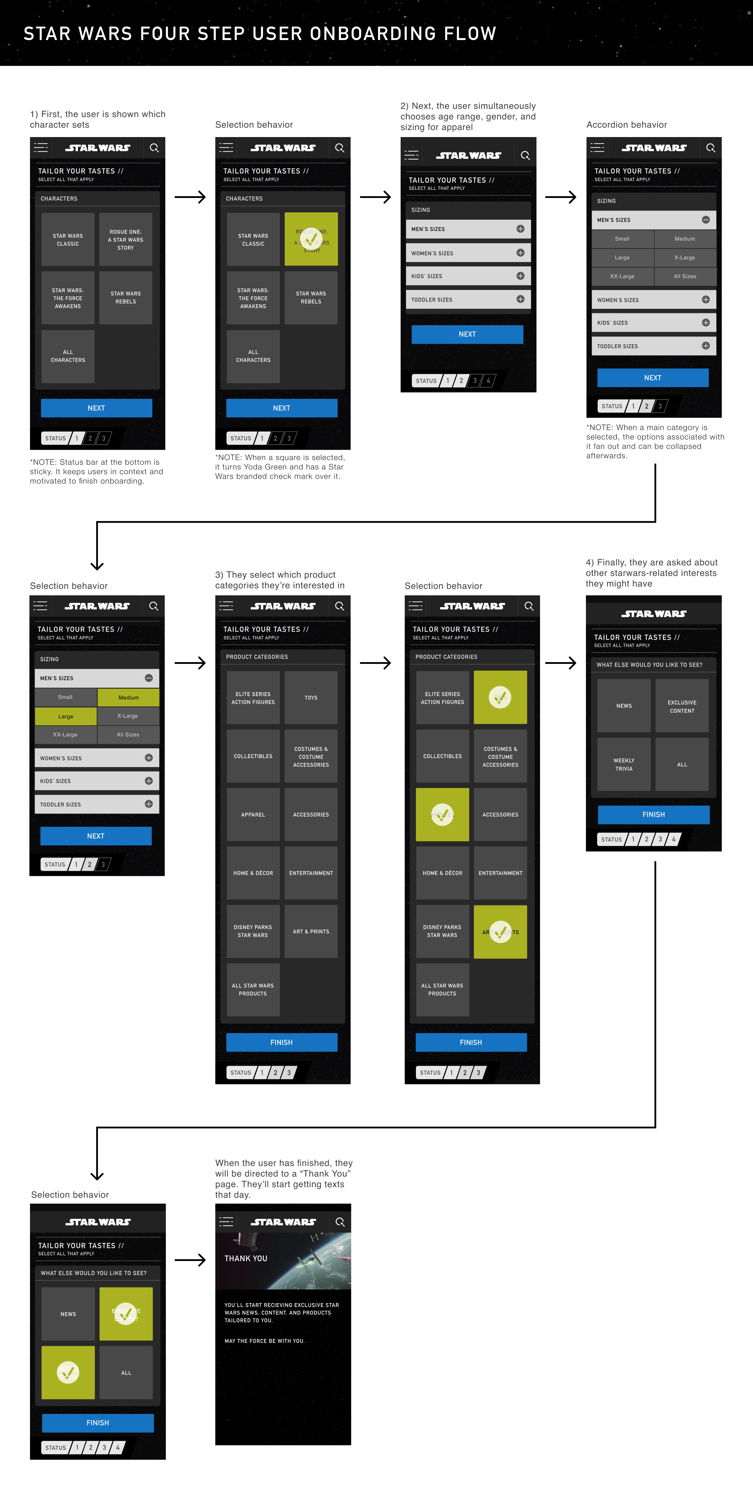
Through the Disney Accelerator Program, we were given the opportunity to work with several departments at Disney. They wanted us to experiment different ways to apply MessageYes' technology to some select businesses they had. I created designs for Disney Music Group (which would sell vinyl record releases of their beloved movies), Marvel, Star Wars, and what they were calling Disney Movies at the time, which is now called Disney+.
The one experience we created that really resonated with Disney was Star Wars. The diehard fan base alone was enough to get people to easily sign up for the text messaging service. Plus, there was a new movie coming out that they could promote – Star Wars: Episode VIII - The Last Jedi.
Before presenting designs of this experience to anyone at Disney, our head of customer success and I decided to conduct our own research by interviewing 3 groups, all fitting a different demographic (Star Wars fans 18-35 years old, fans 35+ years old, and people who had close friends, children, and other relatives that were big fans of Star Wars). This helped us determine what kind of content and product offerings they'd like to see and how often they might be sent offers.
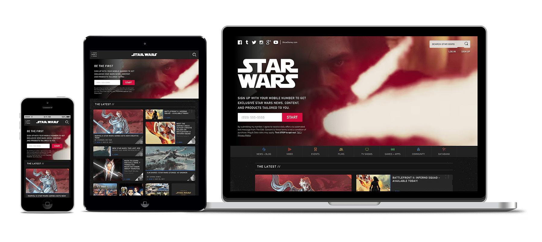
I created a hero section for the Star Wars website, the onboarding flow, and content/product offer types. I ended up traveling to Disney's headquarters in L.A. with our CEO and CTO where we presented a prototype of the onboarding flow and select offer types to members from the Accelerator team and the Star Wars media team. It was very well received.

MessageYes – Company Work
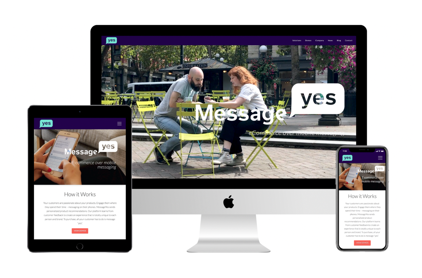
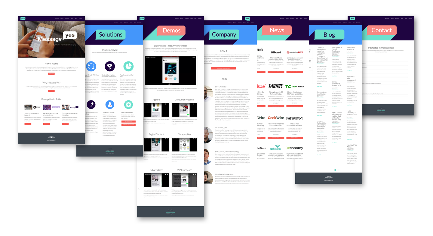
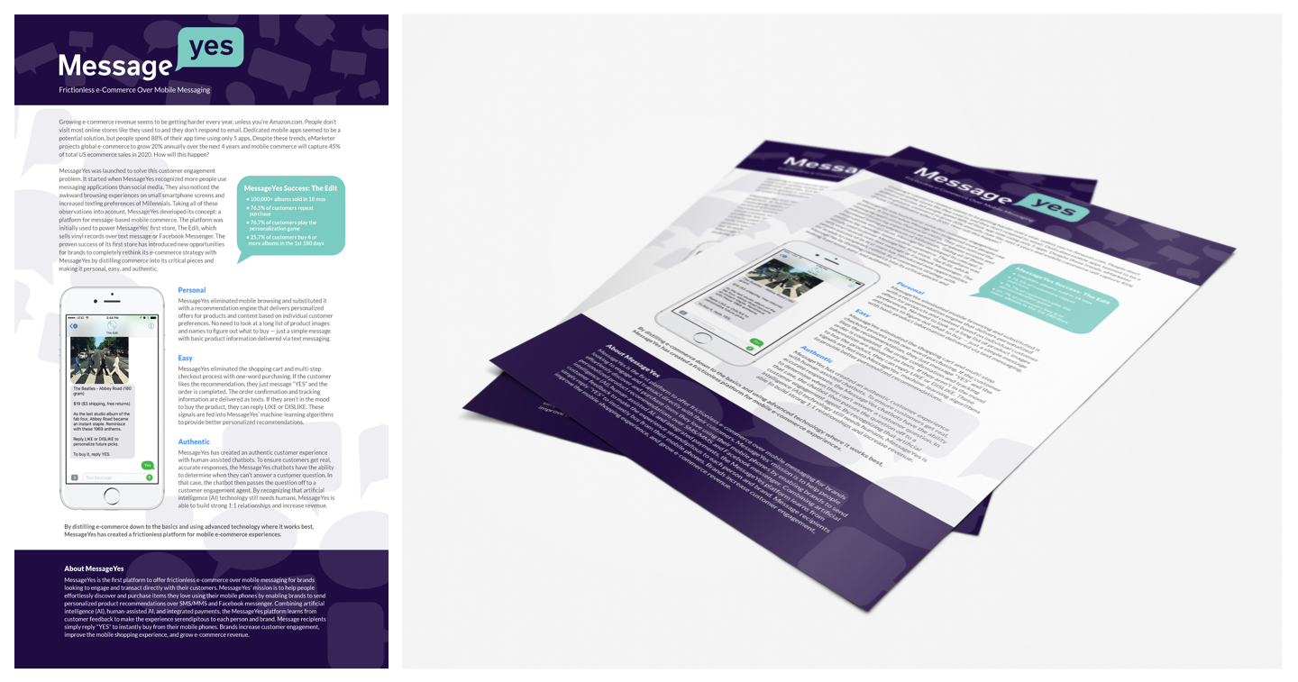
MessageYes was formerly known as ReplyYes. They updated their name and branding just weeks before presenting their company to a worldwide audience on Disney's Demo Day. I was able to give MessageYes a fresh and fun look in their logo and branding, as well as a new website, icon illustrations, demo videos, and a deck template for presentations (one of which was featured on ABC News).
Want to Work Together?
Fantastic! Hit the button below to get started.
