All Work

MessageYes (B2C): The Edit & Origin Bound


Image

Role: Product Designer


Services: Product Design – designing onboarding personalization flows, website design, style guide creation, illustrative branding, marketing assets.


MessageYes (formerly known as ReplyYes) got it start by selling personalized vinyl record recommendations via text message called The Edit. After selling over $1M records within its first year, MessageYes set out to open another virtual storefront with the same personalized, text messaging functionality. They decided to sell comic books and call the store Origin Bound.

I helped come up with user journey maps, personalization flows, website design, and created brands using illustration to give each one their own, unique personality.

Role: Senior Product Designer


Services: Strategy, UX, UI, Illustrative Branding, Graphic Design

Shujinko is a company that created a disruptive product called AuditX, which helps companies get through audits in a more streamlined, easy way.

AuditX is a wholistic auditing software. It not only includes the idea of teamwork, task management, and different access roles on a company level, but it also has a partner portal where companies can invite their auditors to review and approve the evidence the companies provided. This means that you only need a single tool to get a company to successfully start and complete an audit.

Originally, AuditX was built to get startups through SOC2 audits. They added in more audit types, but the current architecture was limiting in many different ways. Over time, current users (startups) requested more audit types and wanted to work with different frameworks.

Shujinko was also pivoting to open up the software for enterprises. Not only did enterprises need access to more frameworks and audit types, but they also needed a more robust software to handle their needs as well as framework customization support.

With the current user needs + our business pivot, we needed to upgrade our backend architechture to be more robust as well as launch an overall product design shift. We called this new shift “Architecture 3”.

Not only was the entire product reimagined in functionality, but UI elements (icons, color palette, etc.) were updated to reflect a more modern interface. One of the biggest ways to demonstrate this dramatic change is to showcase the new architecture 3 navigation in comparison to the old version (AKA: “architeture 2”).

When I joined, I took on the task to help solve the problem of creating a product solution that could scale.

Role: Senior Product Designer


Services: Strategy, UX, UI, Illustrative Branding, Graphic Design

Accomplishments: Redesigned their app

Shujinko is a company that created a product called AuditX, which helps companies get through audits in a more streamlined, easy way.

AuditX is a wholistic auditing software. It not only includes the idea of teamwork, task management, and different access roles on a company level, but it also has a partner portal where companies can invite their auditors to review and approve the evidence the companies provided. This means that you only need a single tool to get a company to successfully start and pass an audit.

Originally, AuditX was built to get startups through SOC2 audits. Over time, current users (startups) requested more audit types and wanted to work with different frameworks.

At this time, Shujinko was also pivoting to open up the software for enterprises. Not only did enterprises need access to more frameworks and audit types, but they also needed a more robust software to handle their needs.

With the current user requests + their business pivot, they needed an overall product design shift. Internally, this new shift was called “Architecture 3”.

This is when Shujinko hired me. I took on the task to help solve the problem of creating a product solution that could scale. Not only was the entire product reimagined in functionality, but UI elements (icons, color palette, etc.) were updated to reflect a more modern interface.


The Edit: Product Design


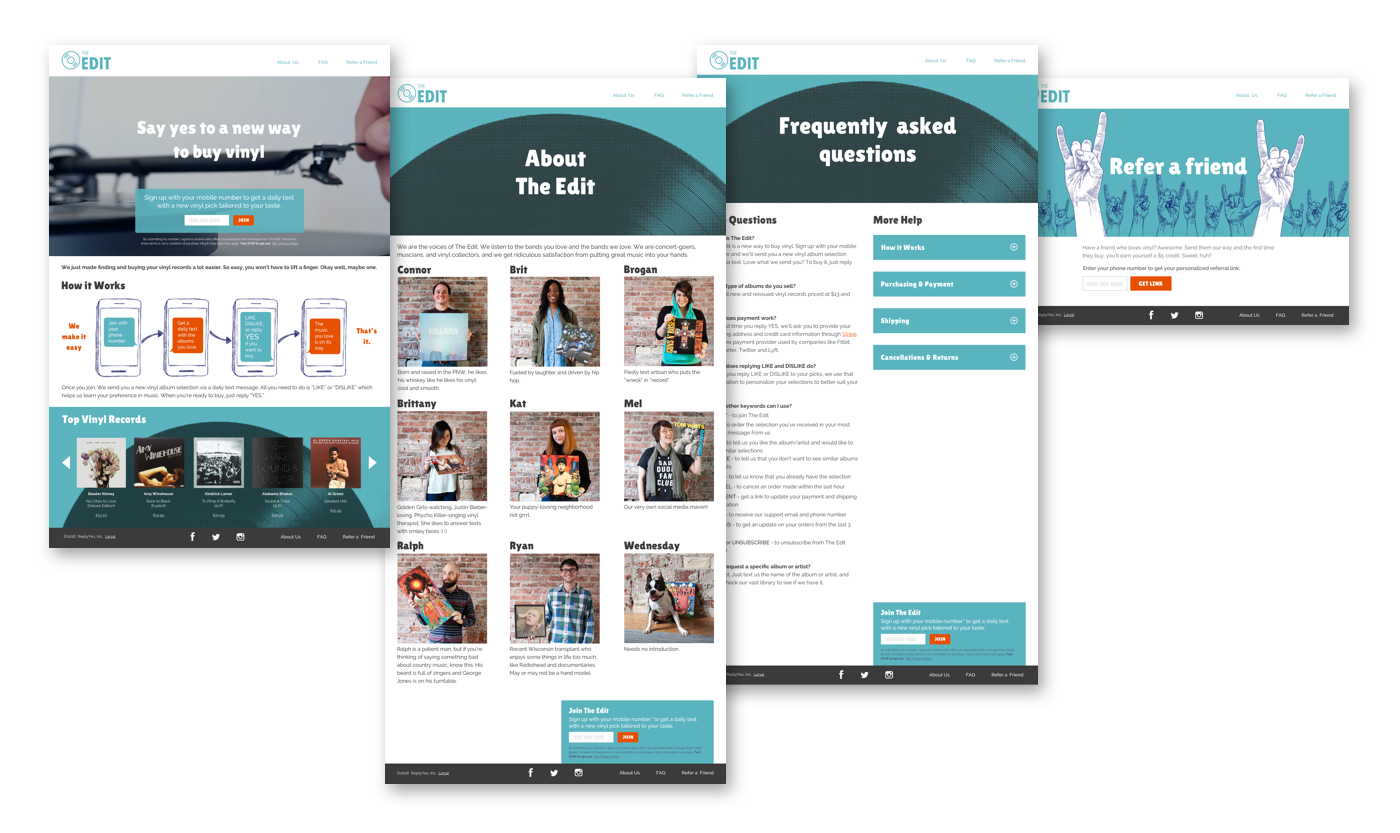
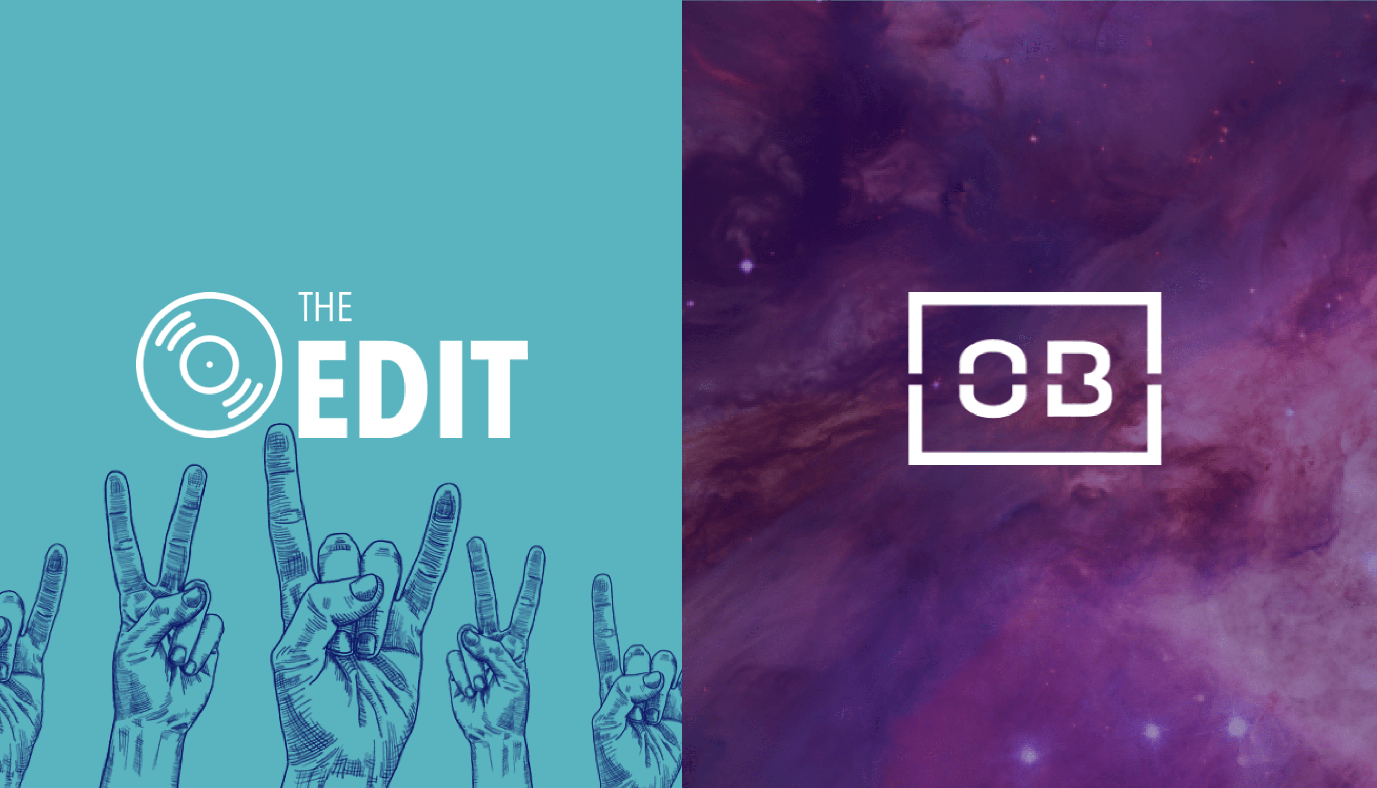
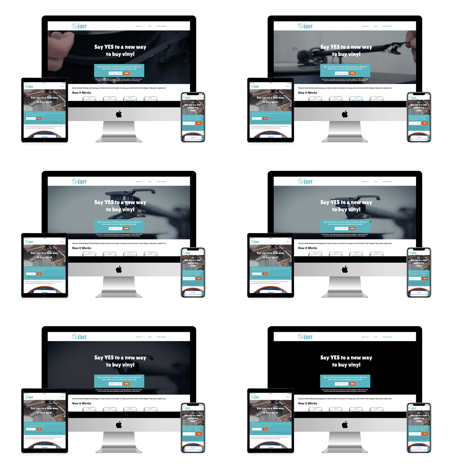
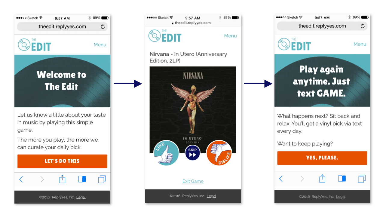
When I joined, this startup had only been open for a few months and realized they needed to create legitimacy in order to obtain more customers via a better web presence. After consulting, it was decided they needed to create brand loyalty to expand their customer base. I created an illustrative brand identity that played nicely with their existing logo to make The Edit feel more personable. I then designed a simple, fun website for the dev team to build. All of their new brand assets were applied to their website, as well as a simple personalization quiz for their users to take. 

After branding and website designs were created, I assisted in UX design for their personalization quiz and copywriting for their messaging service to give their users an optimal experience. As a result, they were able to get more customers through their virtual doors. The startup was so strong that Universal Music Group took notice and purchased The Edit. 
ImageImage

Error Page Designs

Image

Select Pages From The Personalization Experience
Image

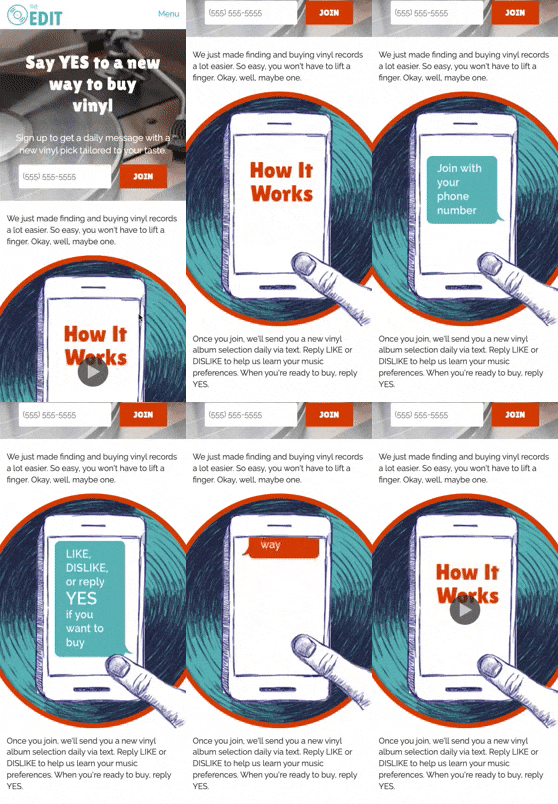
'How It Works' Section (mobile)


Image

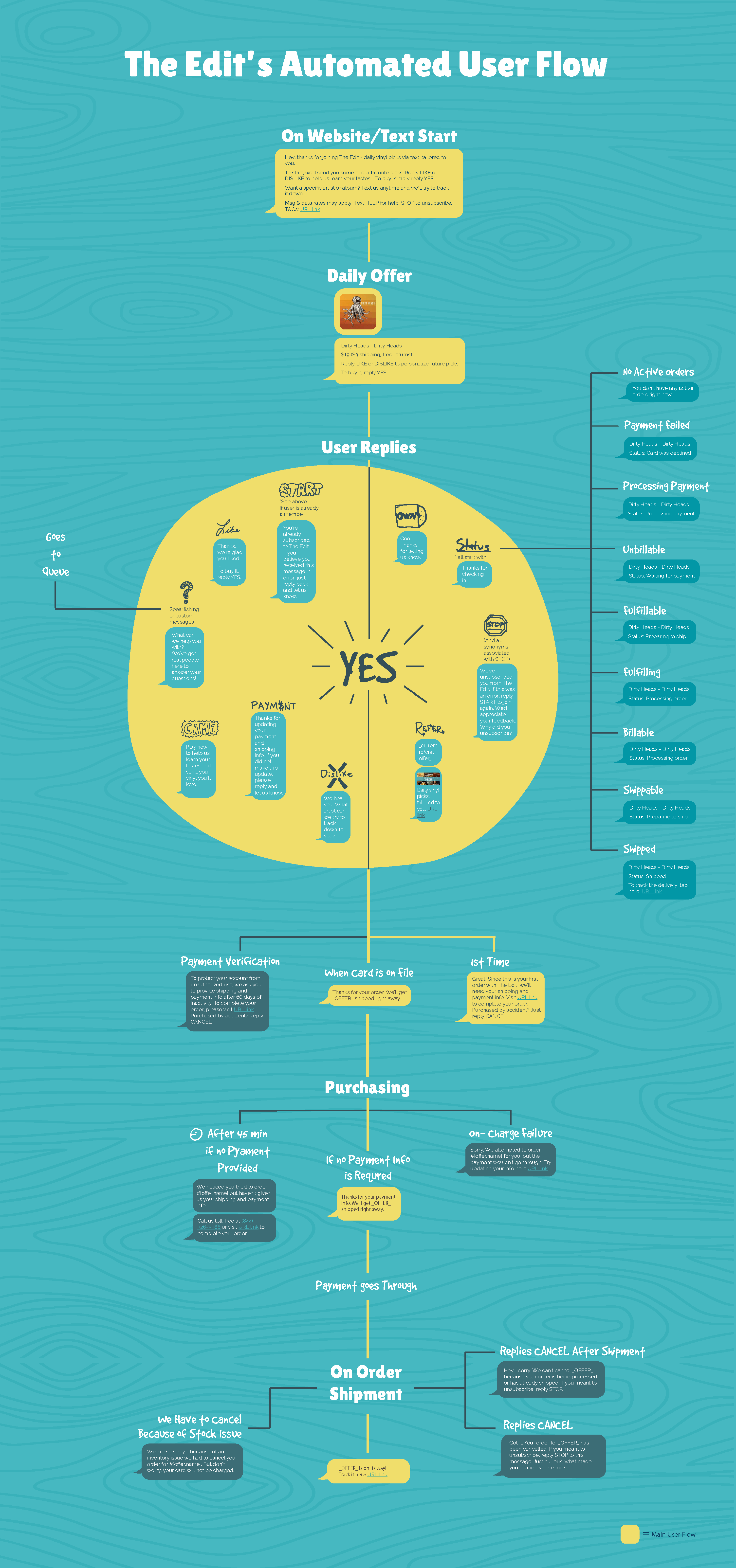
Text Messaging Flowchart 


Image

The Edit: Illustrative Branding


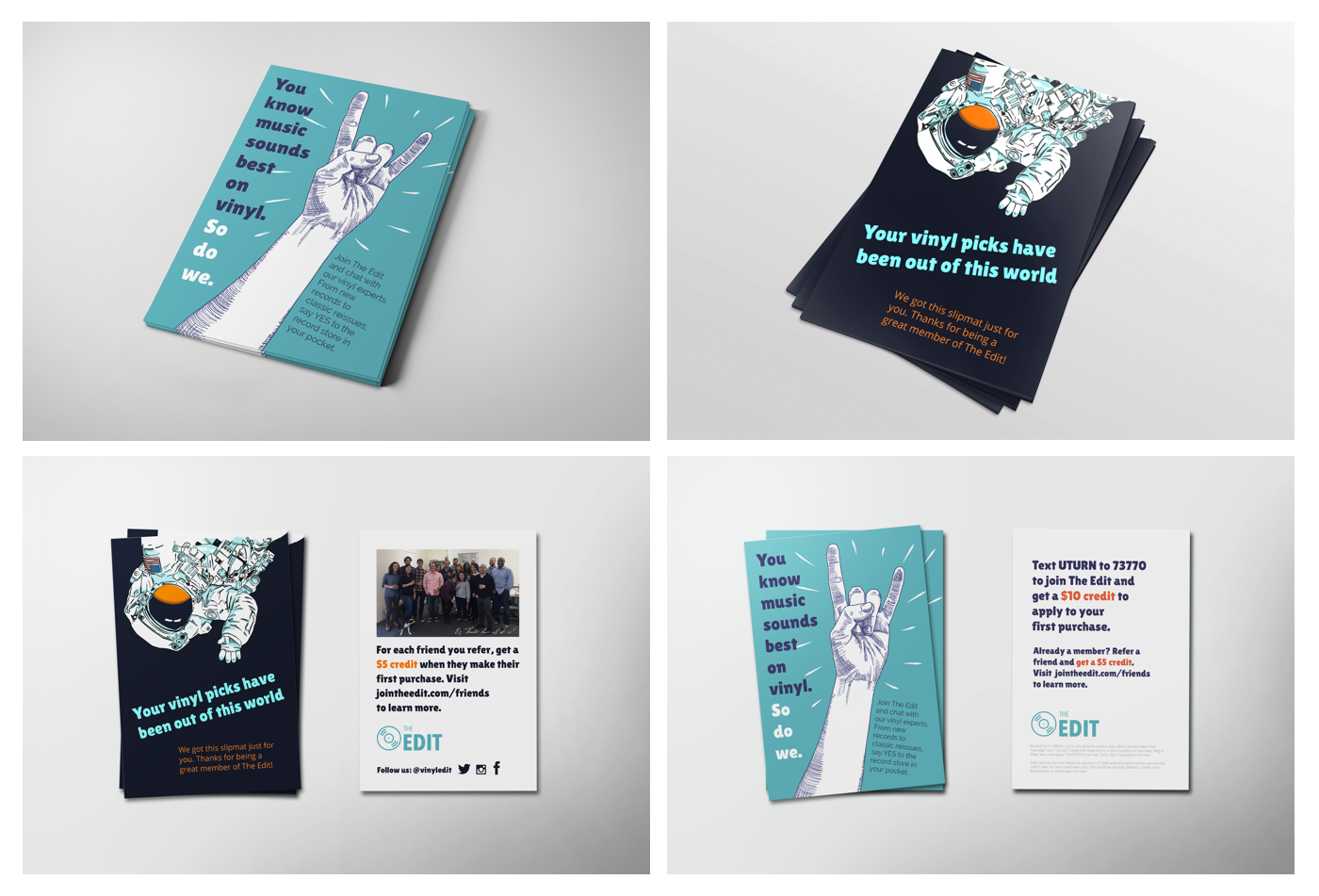
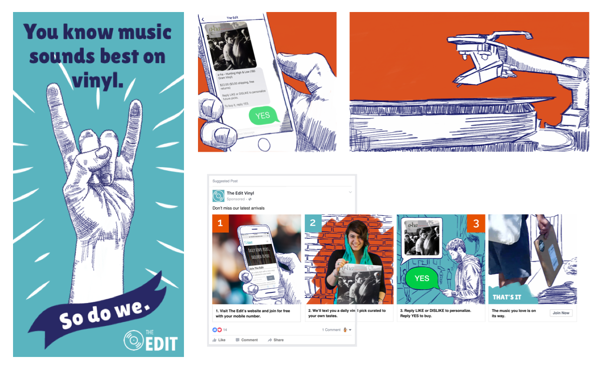
Below are select examples of the illustrative branding for The Edit, as well some marketing assets I created.


Social Media Ads
Image

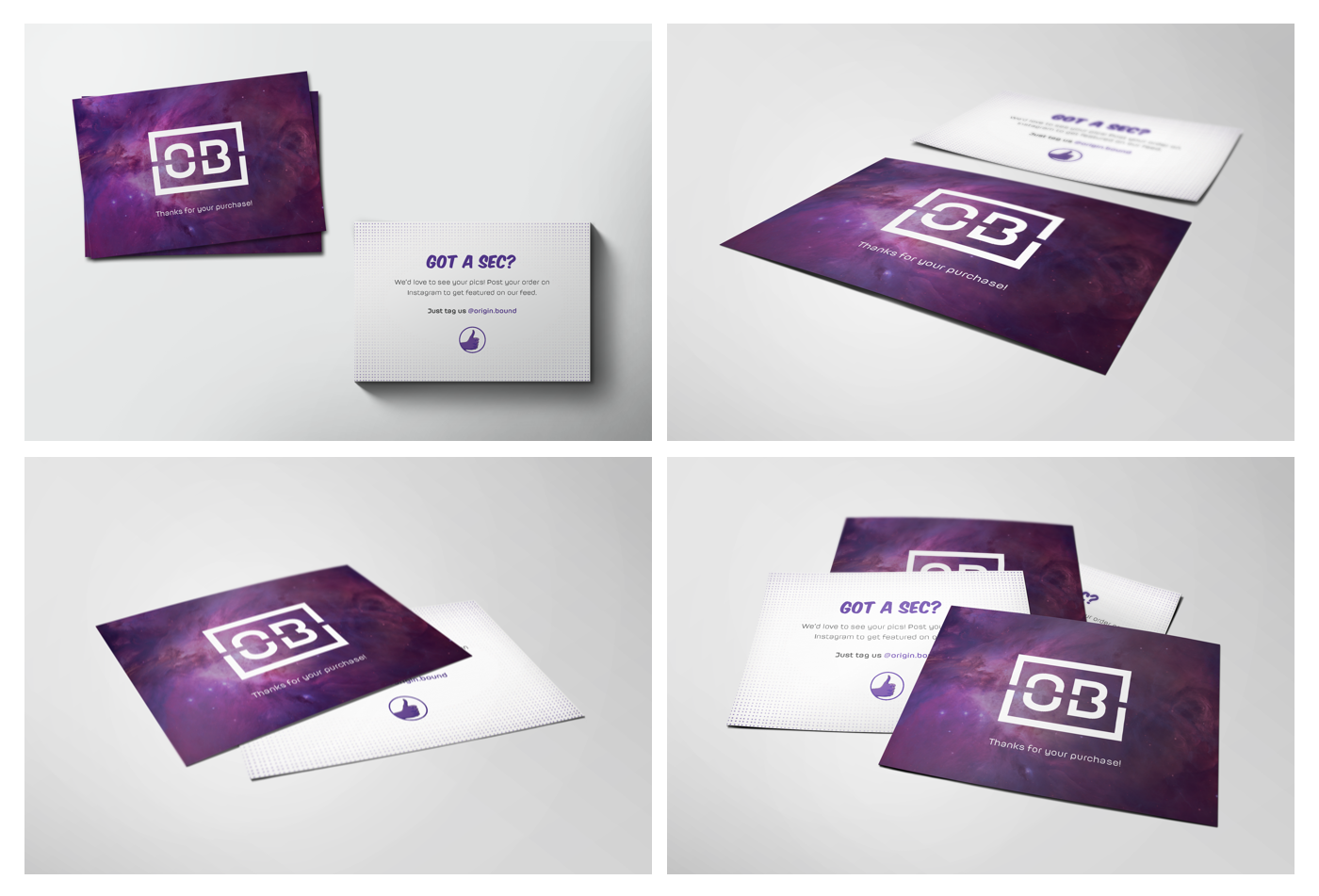
Package Inserts 

Image

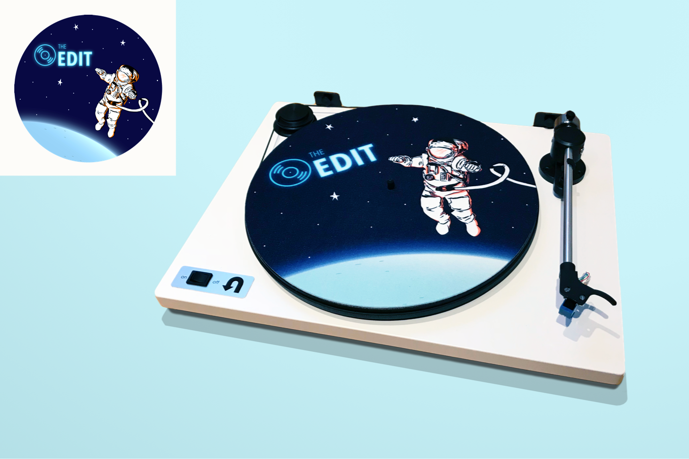
Record Slipmat


Image

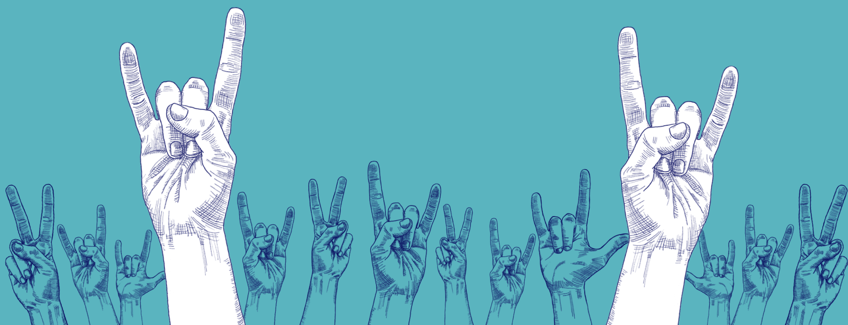
Hero Image on Website


Image

Happy Holidays Text Message


Image

Origin Bound: Product Design


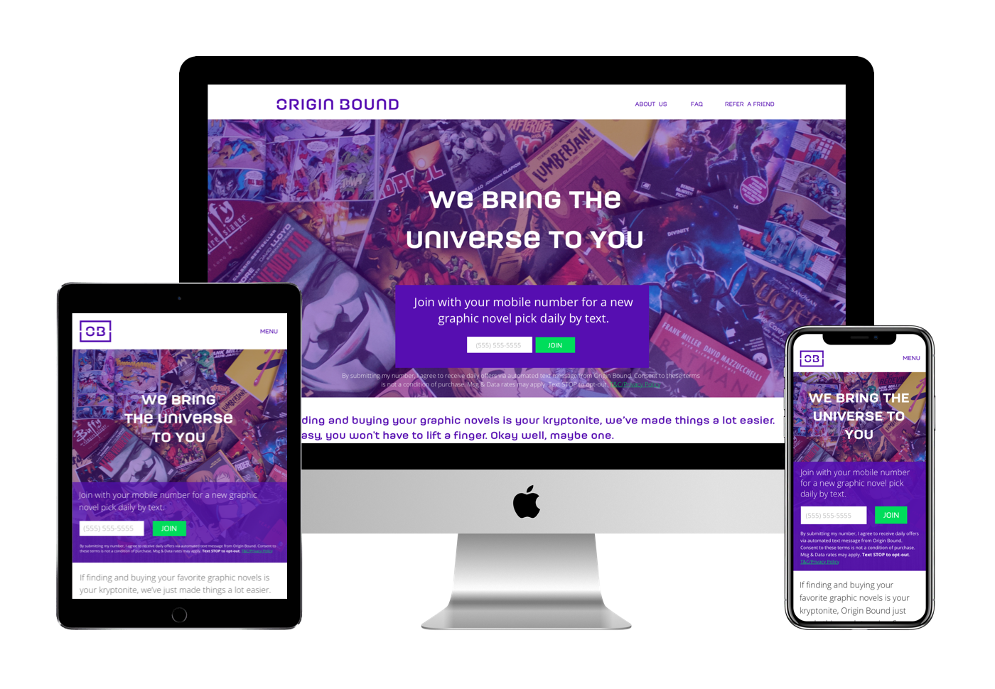
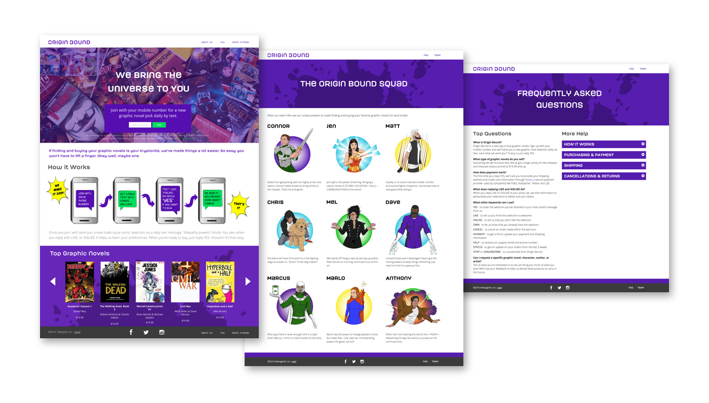
Origin Bound came after The Edit. MessageYes wanted to follow the same main user formula as they did with The Edit, but for it to feel unique and very much tied into comic books. I created an illustration style to fit this aethetic.

We were in the middle of selling this store to Skybound Entertainment (owners of The Walking Dead), but Nordstrom swooped in and acquired the whole company (MessageYes).
ImageImage

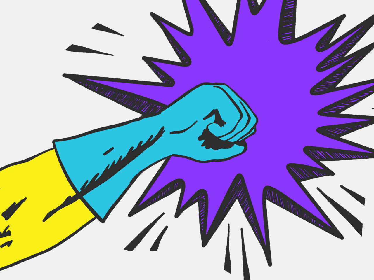
Error Page Designs

Image

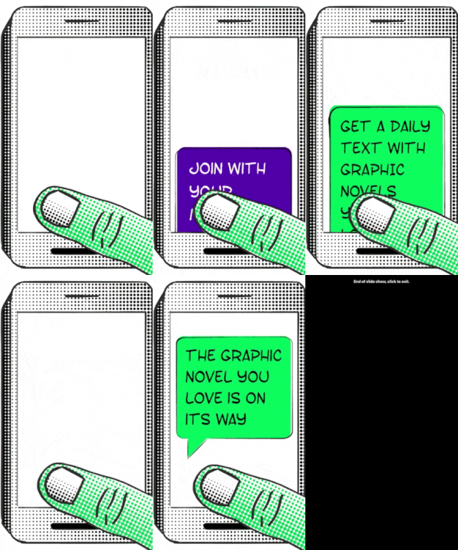
Mobile 'How It Works' Section


Image

Origin Bound: Branding


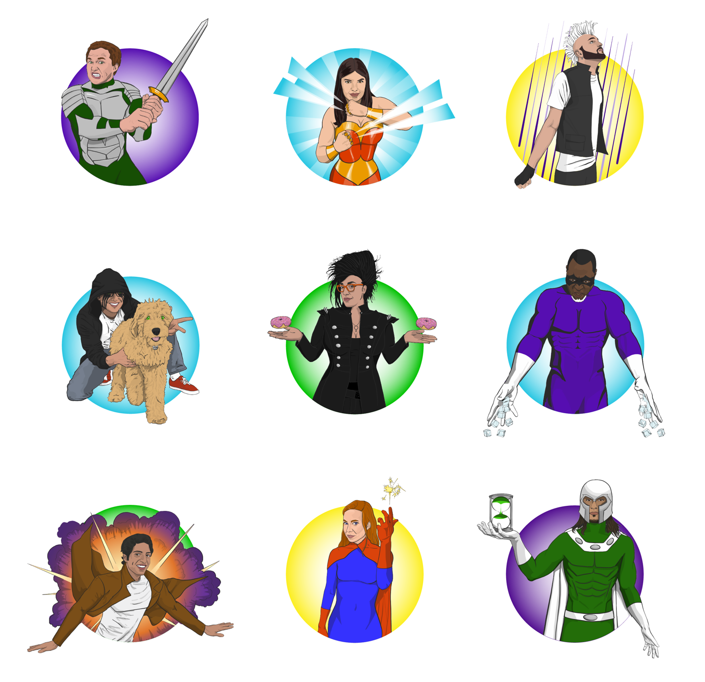
I created a logo along with a website featuring custom illustrations for this comic-wielding business. I also illustrated every Origin Bound employee and gave each of them a superpower + costume of their choice. Representing Origin Bound employees as comic book characters further demonstrates how charismatic and fun this business was for their demographic to engage with.


Logo Design + Basic Styles

ImageImage

Origin Bound Staff Illustrations

Image

Origin Bound Staff Package Inserts

Image

Want to Work Together?

Fantastic! Hit the button below to get started.