Role: Senior Product Designer
Services: Product Design, UX/UI, Design System, Illustrative Branding, Brand Guidelines Refinement, Marketing Materials
Shujinko is a company that created a product called AuditX, which helps companies get through audits in a more streamlined, easy way.
AuditX is a wholistic auditing software. It not only includes teamwork, task management, and different access roles on a company level, but it also has a partner portal where companies can invite their auditors to review and approve the evidence the companies provided. This means that you only need a single tool to get a company to successfully start and pass an audit.
Originally, AuditX was built to get startups through SOC2 audits. Over time, current users (startups) requested more audit types and wanted to work with different frameworks.
At this time, Shujinko was also pivoting to open up the software to enterprises. Not only did enterprises need access to more frameworks and audit types, but they also needed a more robust software to handle all of their auditing needs.
With the current user requests + their business pivot, they needed an overall product design shift. Internally, this new shift was called “Architecture 3”.
This is when Shujinko hired me. Although I made design amendments and updates to the current architecture, I mainly took on the task to help solve the problem of creating a product solution that could scale. Not only was the entire product reimagined in functionality, but UI elements (icons, color palette, etc.) were updated to reflect a more modern interface.
I designed all of the new experiences for the app, as well as improved upon existing ones. In this portfolio entry, I'm not focusing on a particular experience, but instead, I'm including brief synopses of broader examples that reflect my work at Shujinko: Navigation Update, Dashboards & Overviews, Onboarding & Guidance Experiences, Components, and Brand Work
New Dashboard & Updated Audit Overview Pages
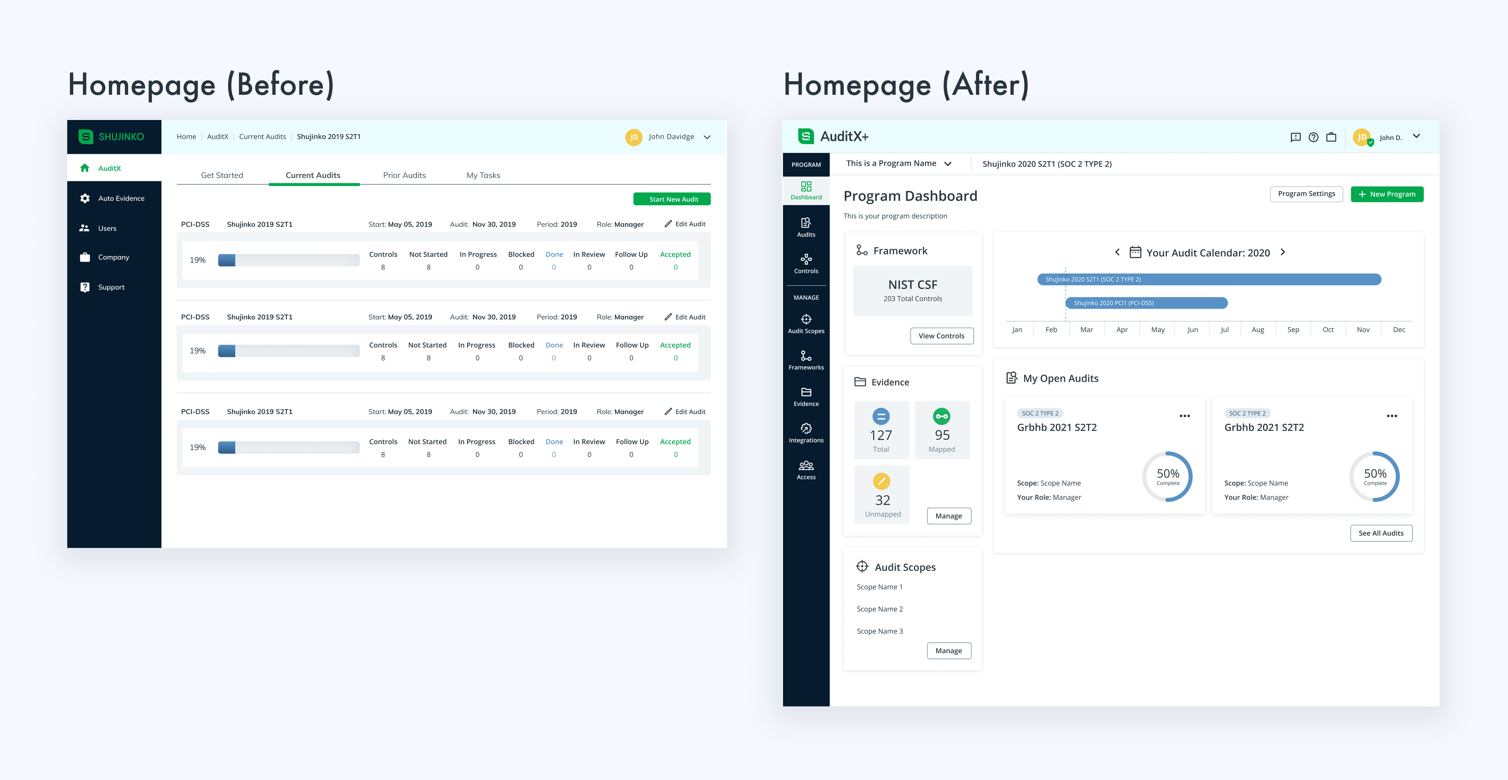
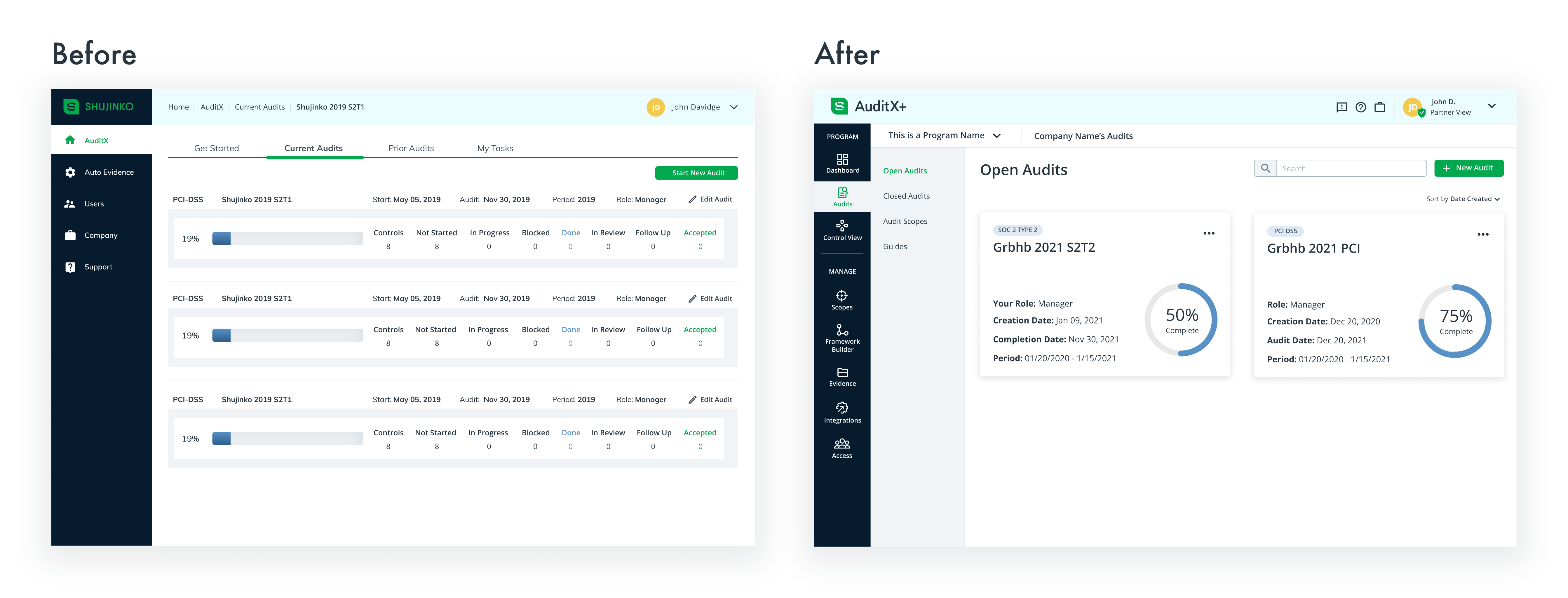
Originally, the homepage was a list of a user's current audits. When creating their new architecture, Shujinko introduced the concept of programs into AuditX. This was a feature requested from auditors, potential enterprise clients, and startups that had more advanced knowledge of audits.
Given the fact that each program has a framework assigned to it and houses many audits, it was only a natural progression that Programs would become the new home base for users. The new dashboard needed to include the most pertinent information about the audits and framework that was included in the selected program, while still being easy to use.
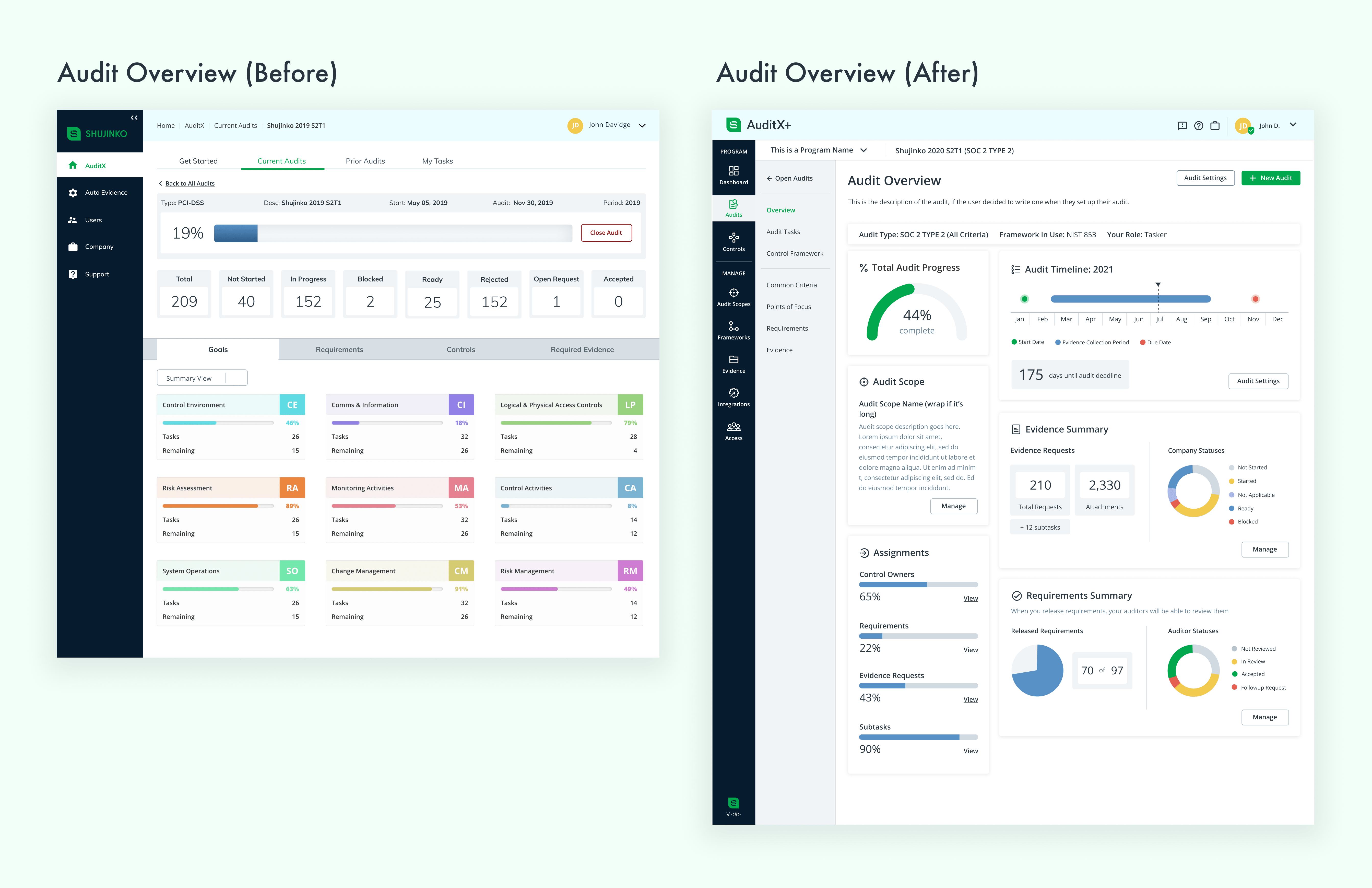
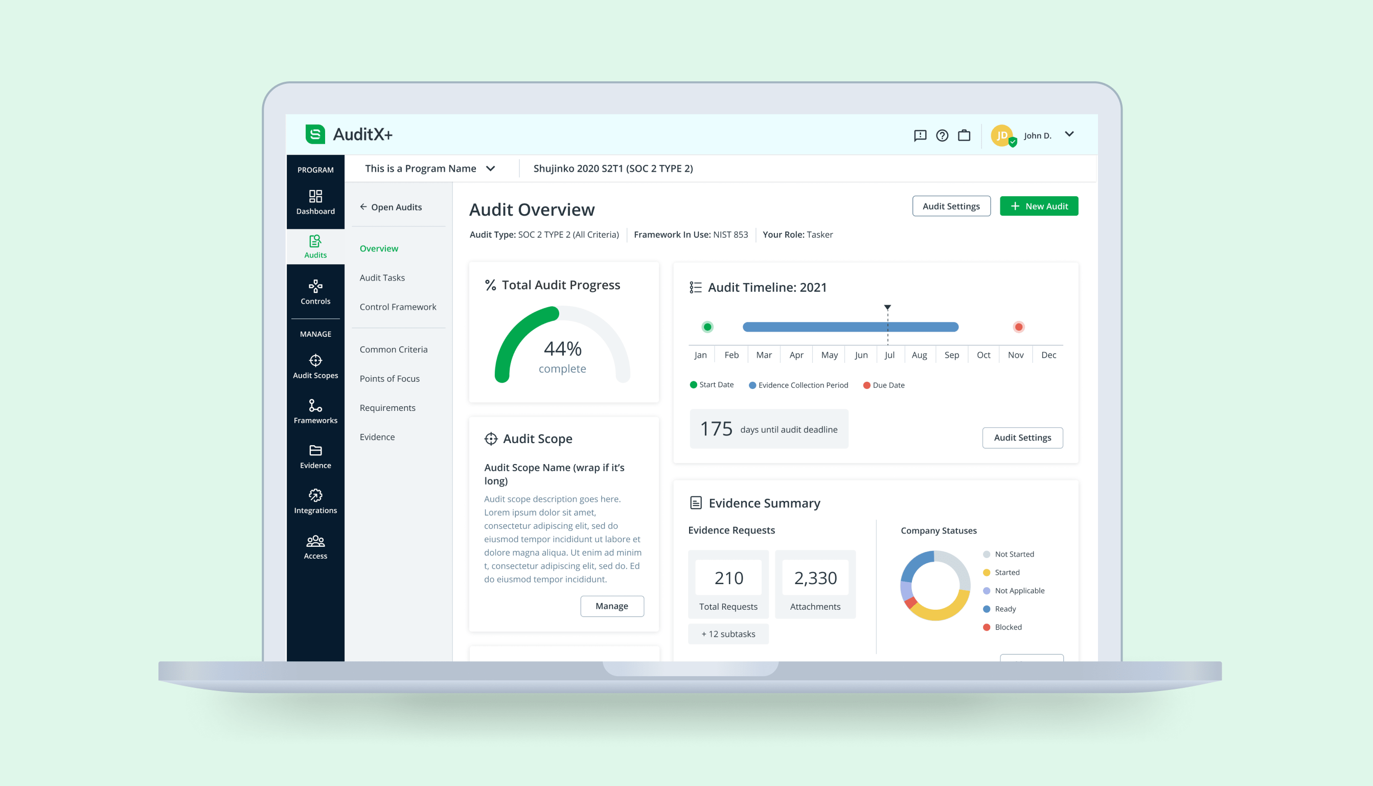
After conducting user interviews with both companies and auditing firms, we found that they were requesting more helpful information in the audit overview so they could get a better picture of their audit's progress. We found overlapping interests in several data points from those interviews and used that information in the audit overview page. Adding team activity and notifications was planned as a fast follow in build.
This overview also serves as an example of how I updated the color palette in the app. At the time I joined, the brand colors and app colors were not aligned. I reworked the brand guidelines, which included the color palette. I then applied those colors in a more meaningful way to provide clarity. It proved especially helpful in the dashboard and overview pages.
In-App Onboarding & Guidance
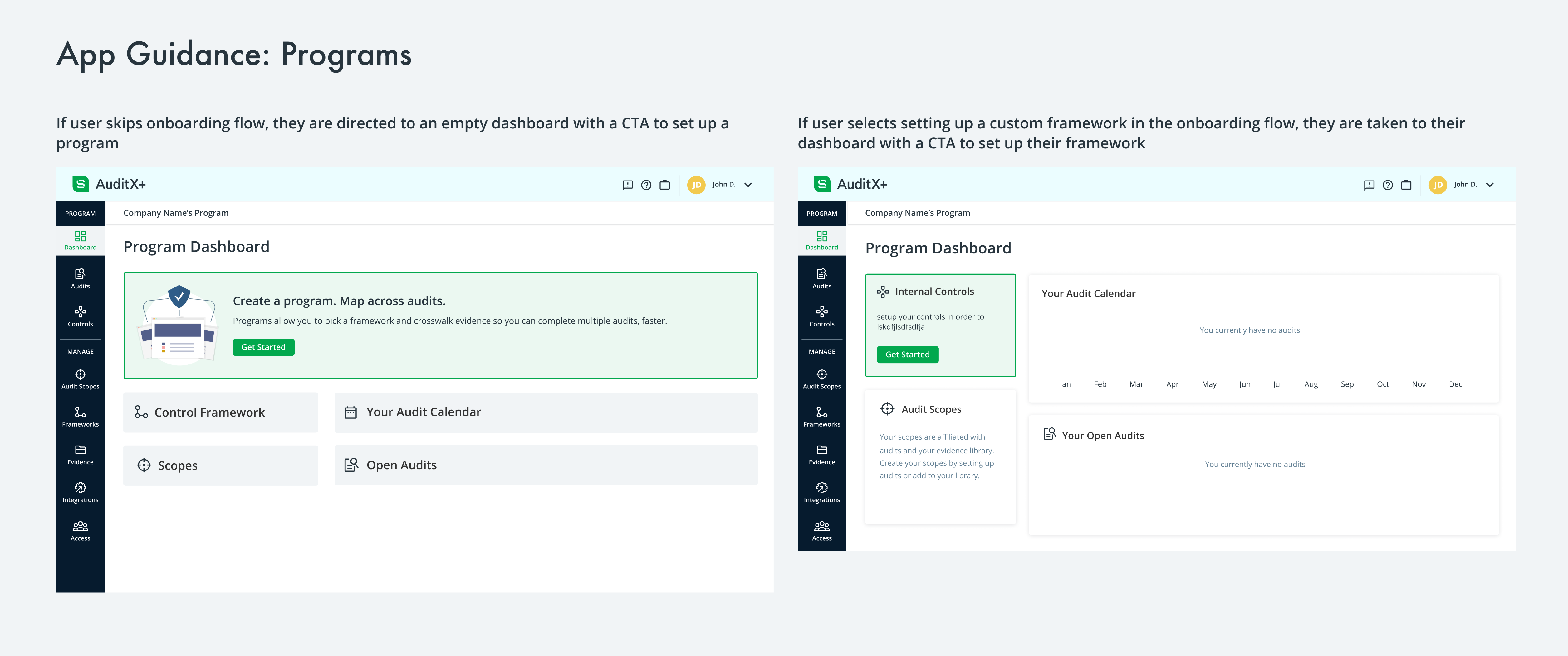
Something that was lacking in the current product was any sense of user direction/guidance within the app. Meeting with a customer success rep was essential for each AuditX customer to understand how to use the product. Something that the new app design includes is onboarding and guidance from the app itself, ensuring better success and a better impression for first time users.
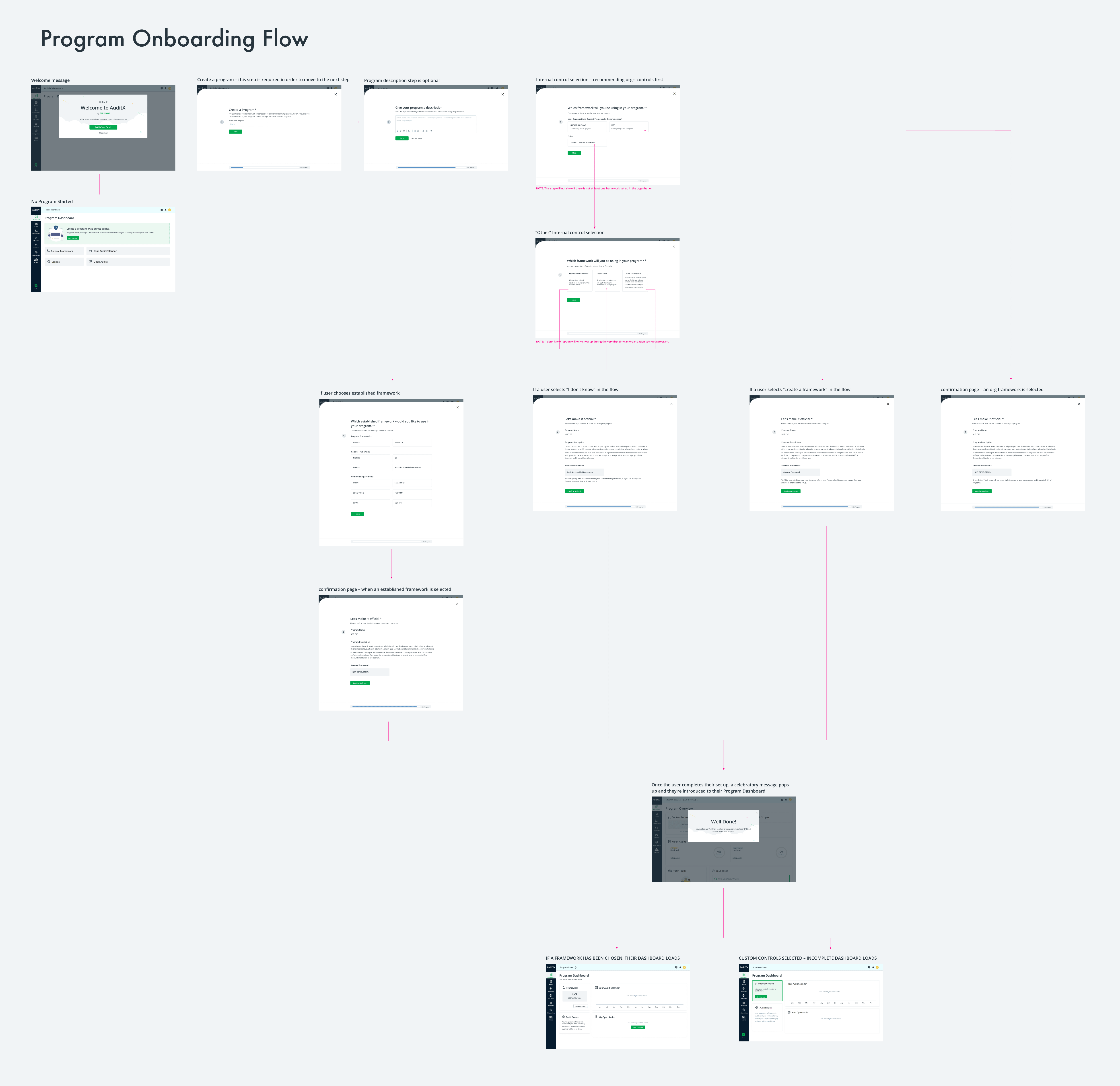
I created onboarding flows using the same UI pattern for adding a new program, audit, scope, and integration. I also created an onboarding flow for frameworks that leads straight into a framework builder tool I designed.
Components
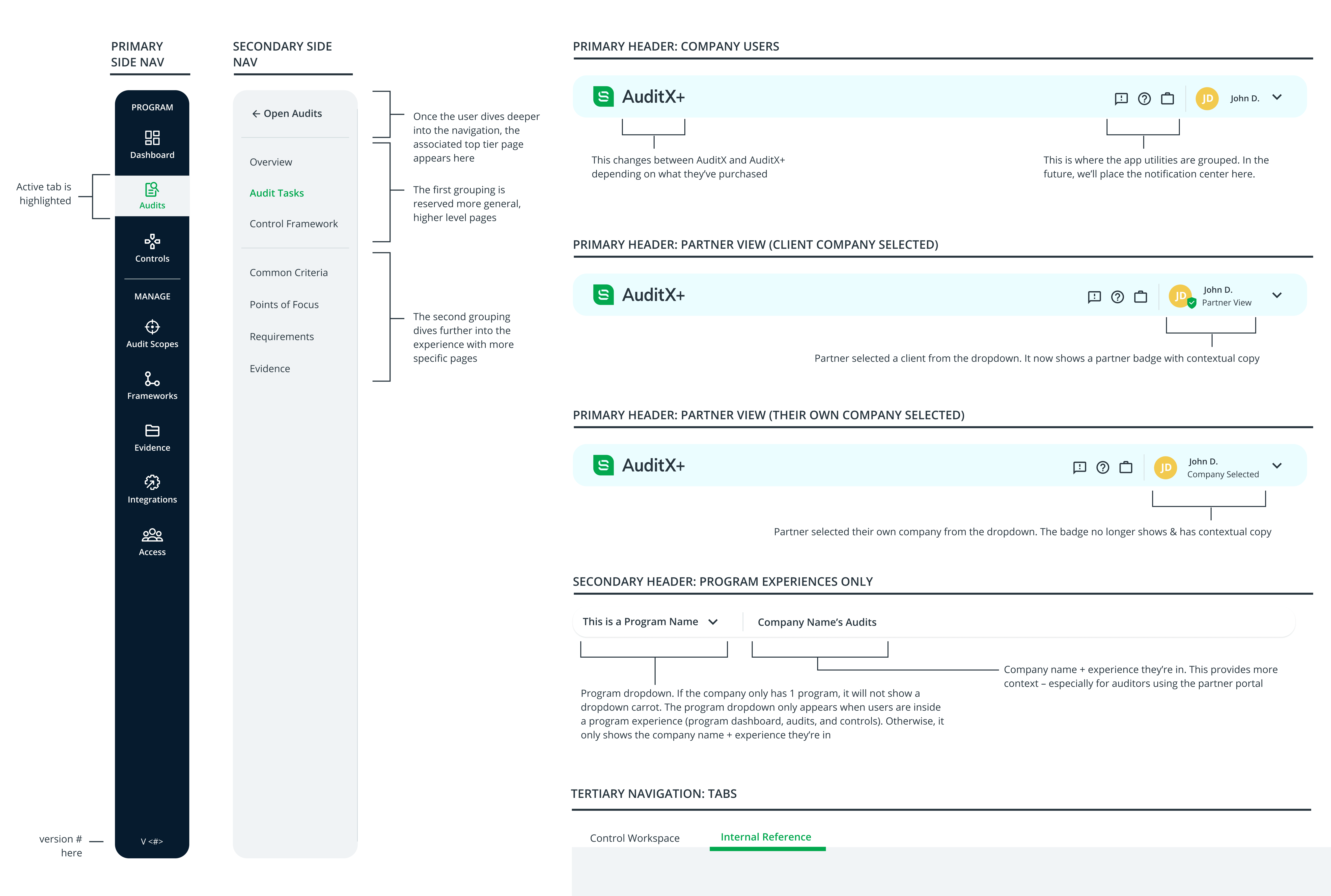
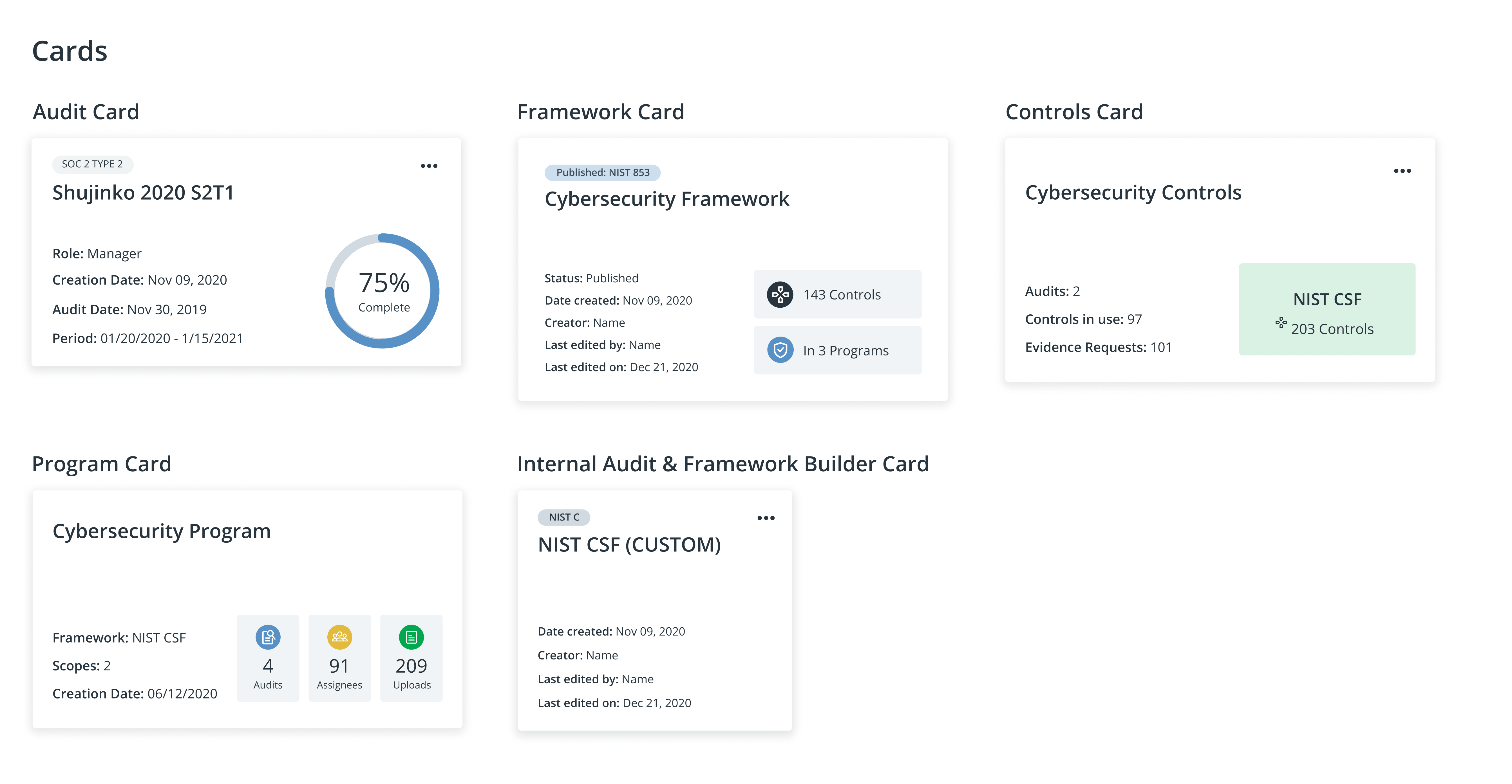
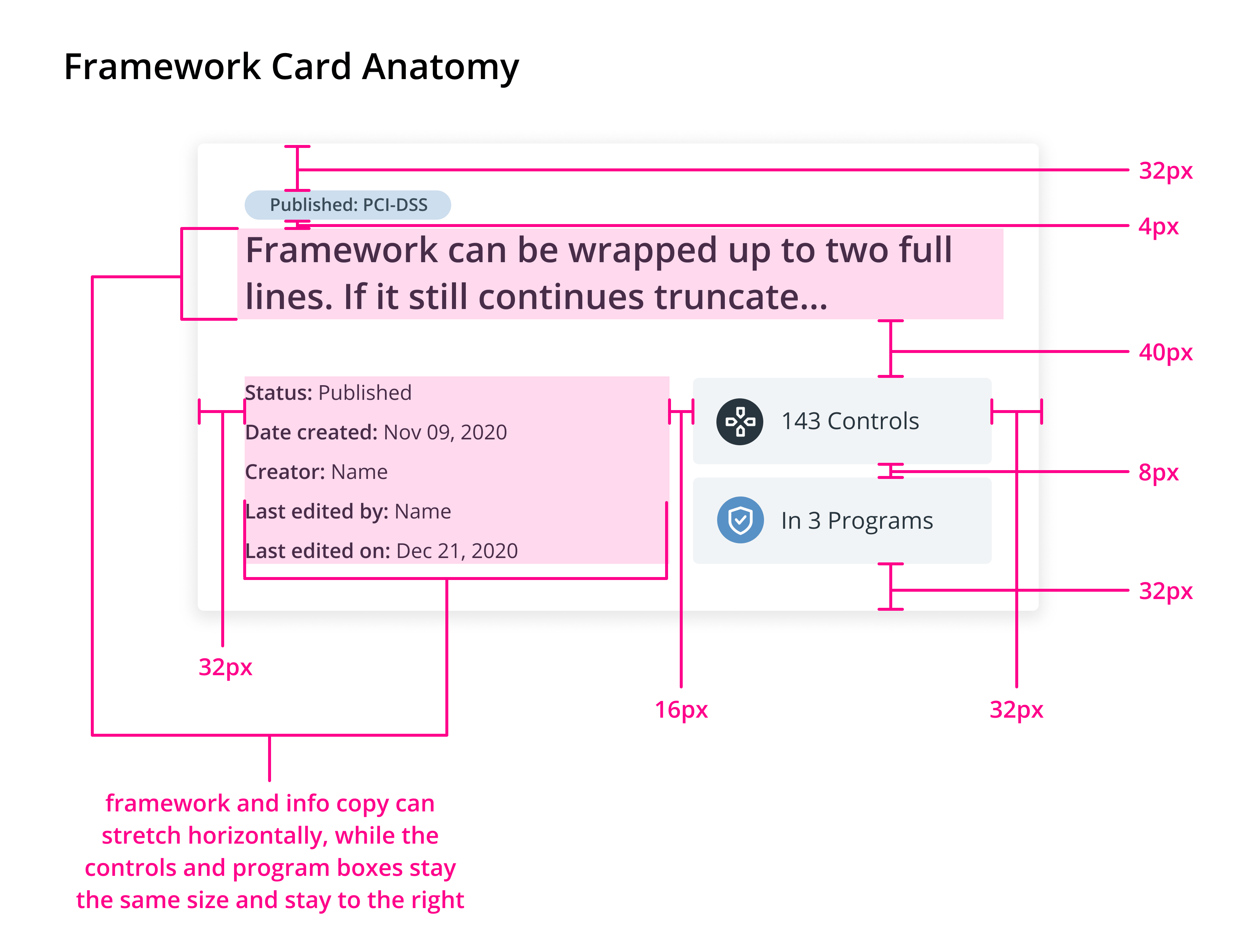
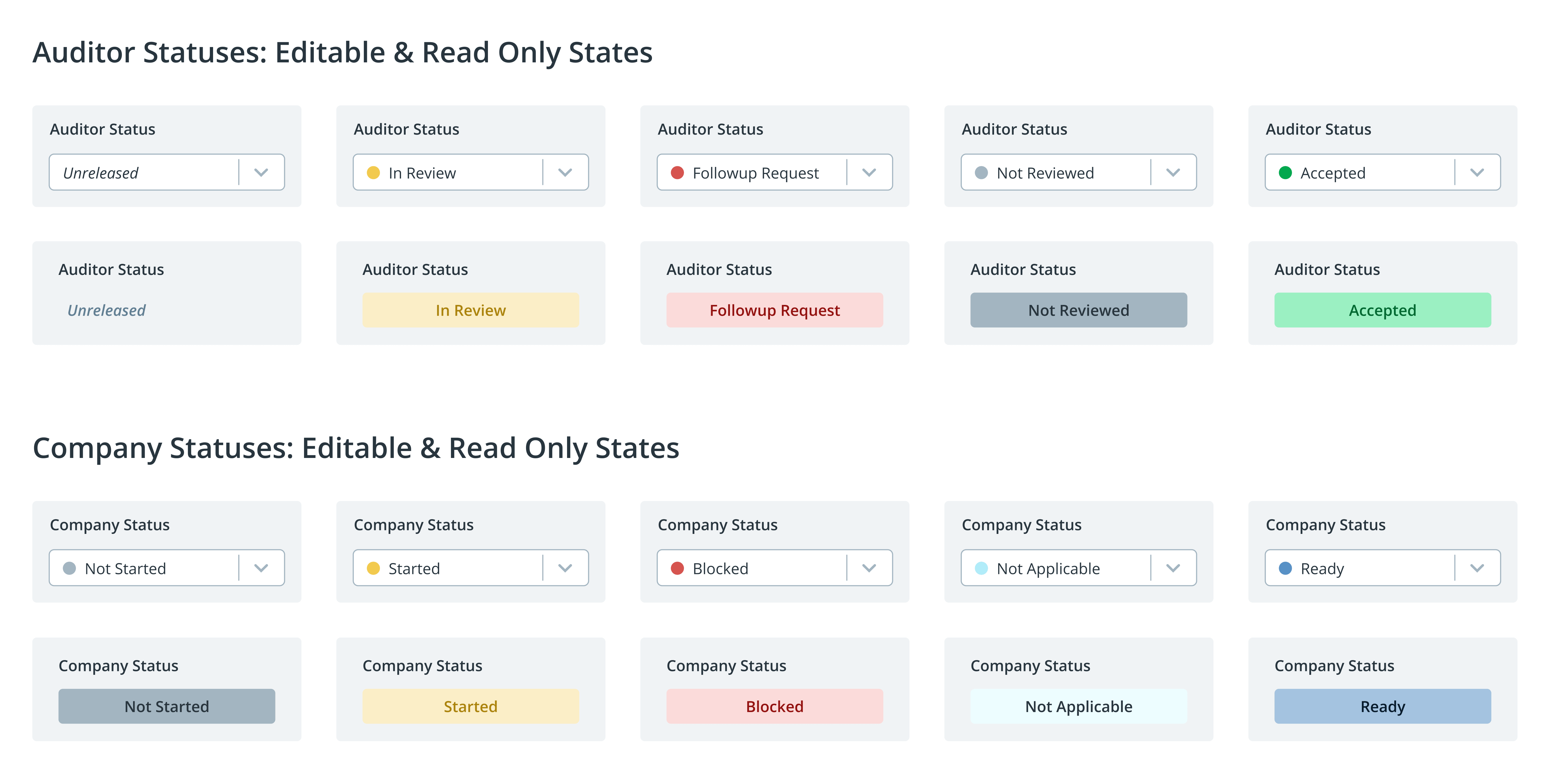
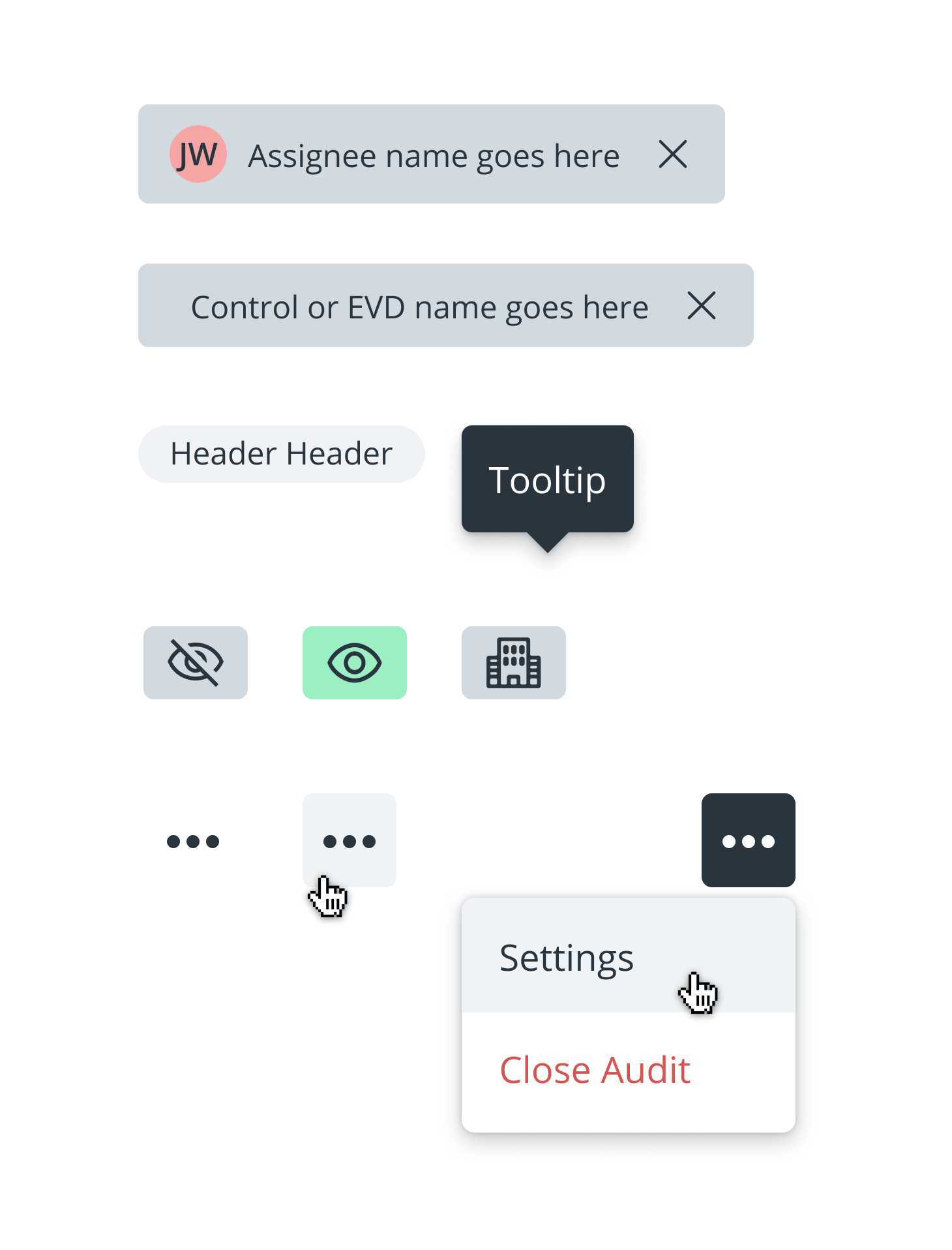
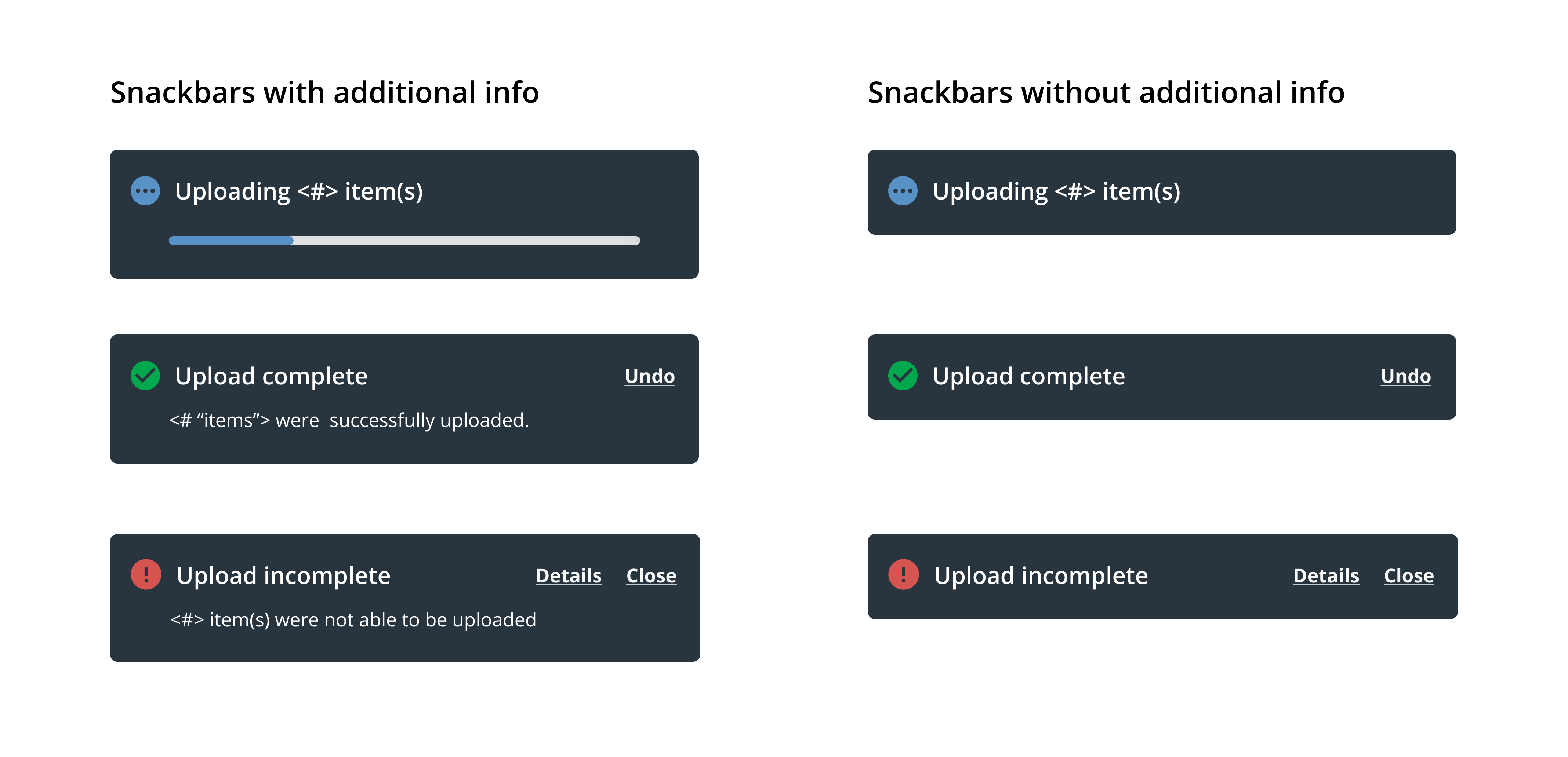
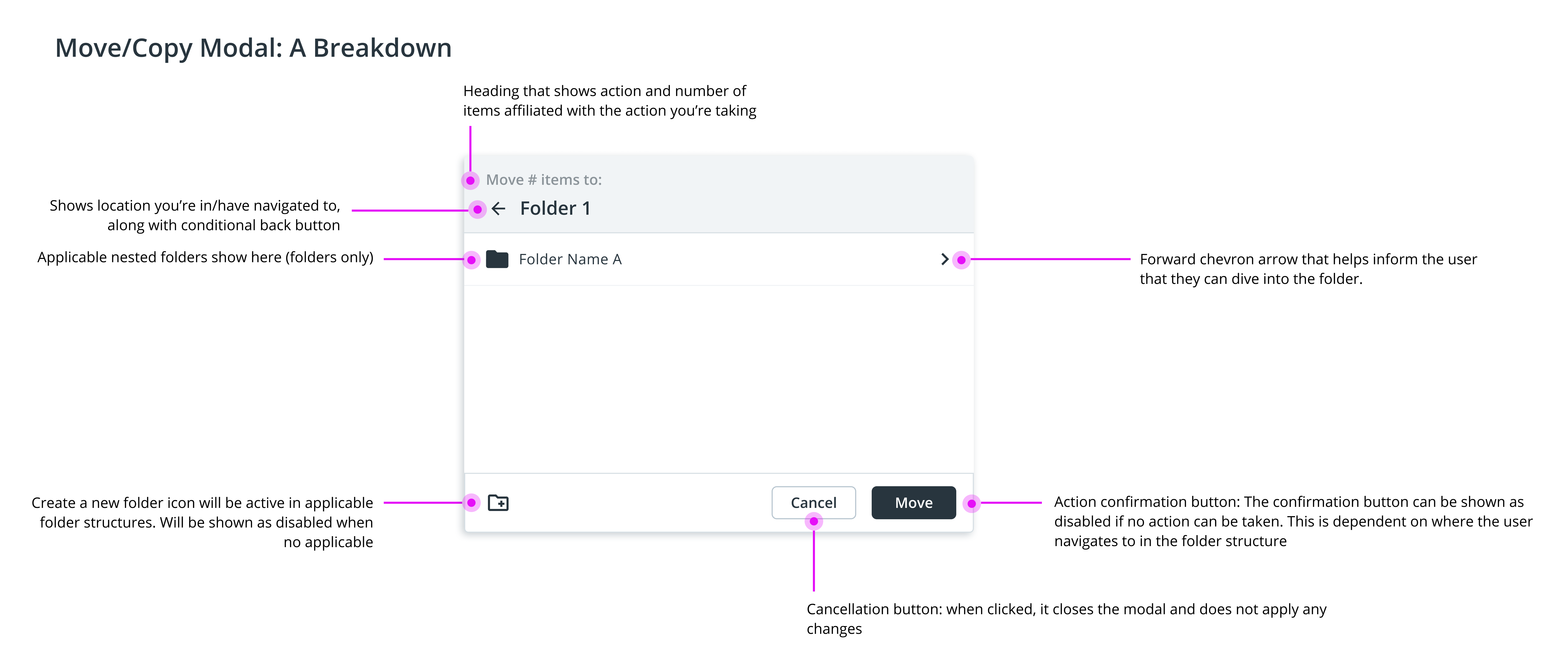
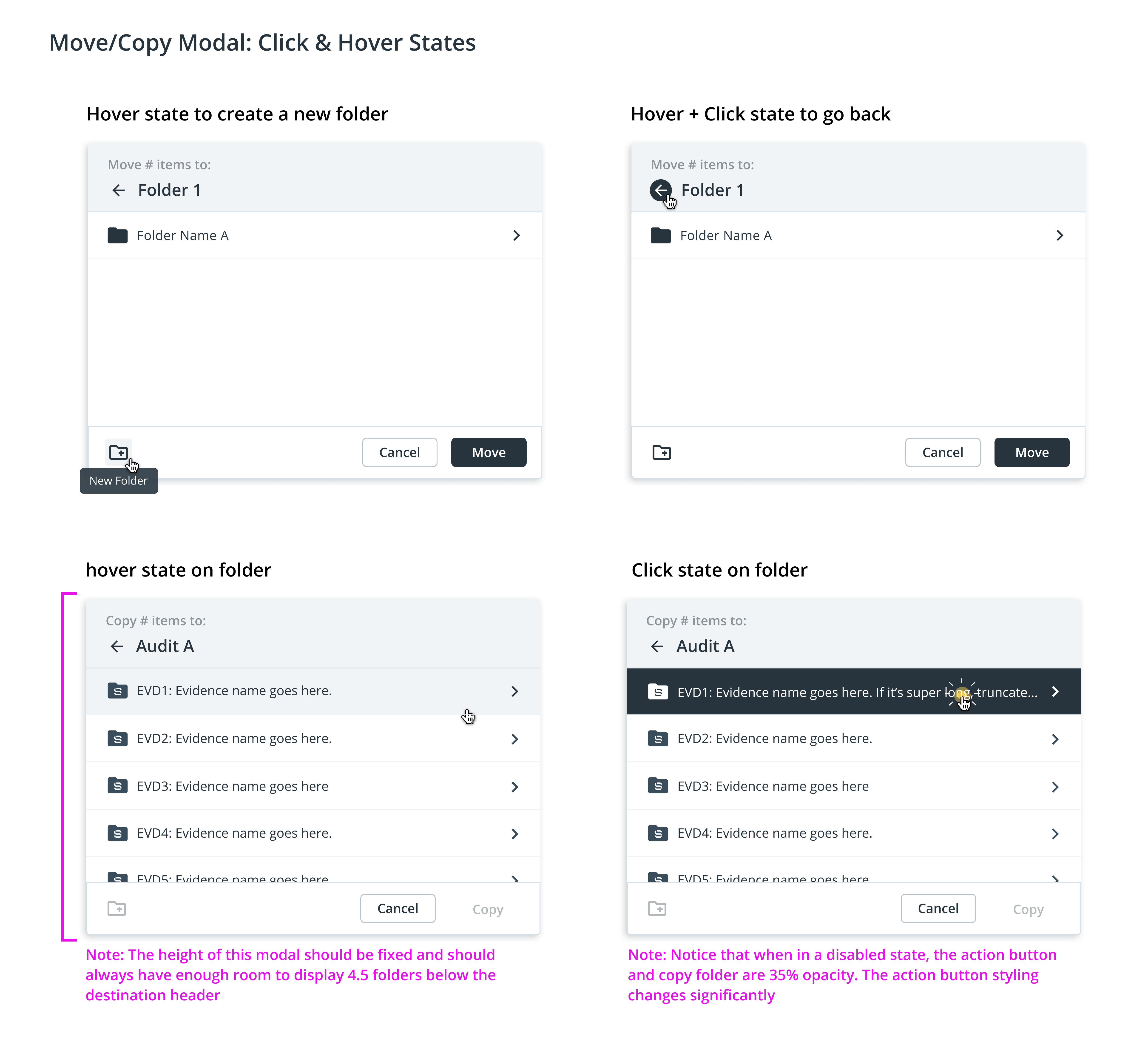
These are some select components that made it into the design system I created in Figma. You'll also notice some anatomy and explanatory image below. These were not included in the design system, but were made for developers and other internal team members to reference.
Brand Work
I created an illustrative language for Shujinko's brand. Those illustrations made their way into AuditX's empty state pages, as well as marketing materials (graphics, website, ebooks, whitepapers, pitch decks, etc).


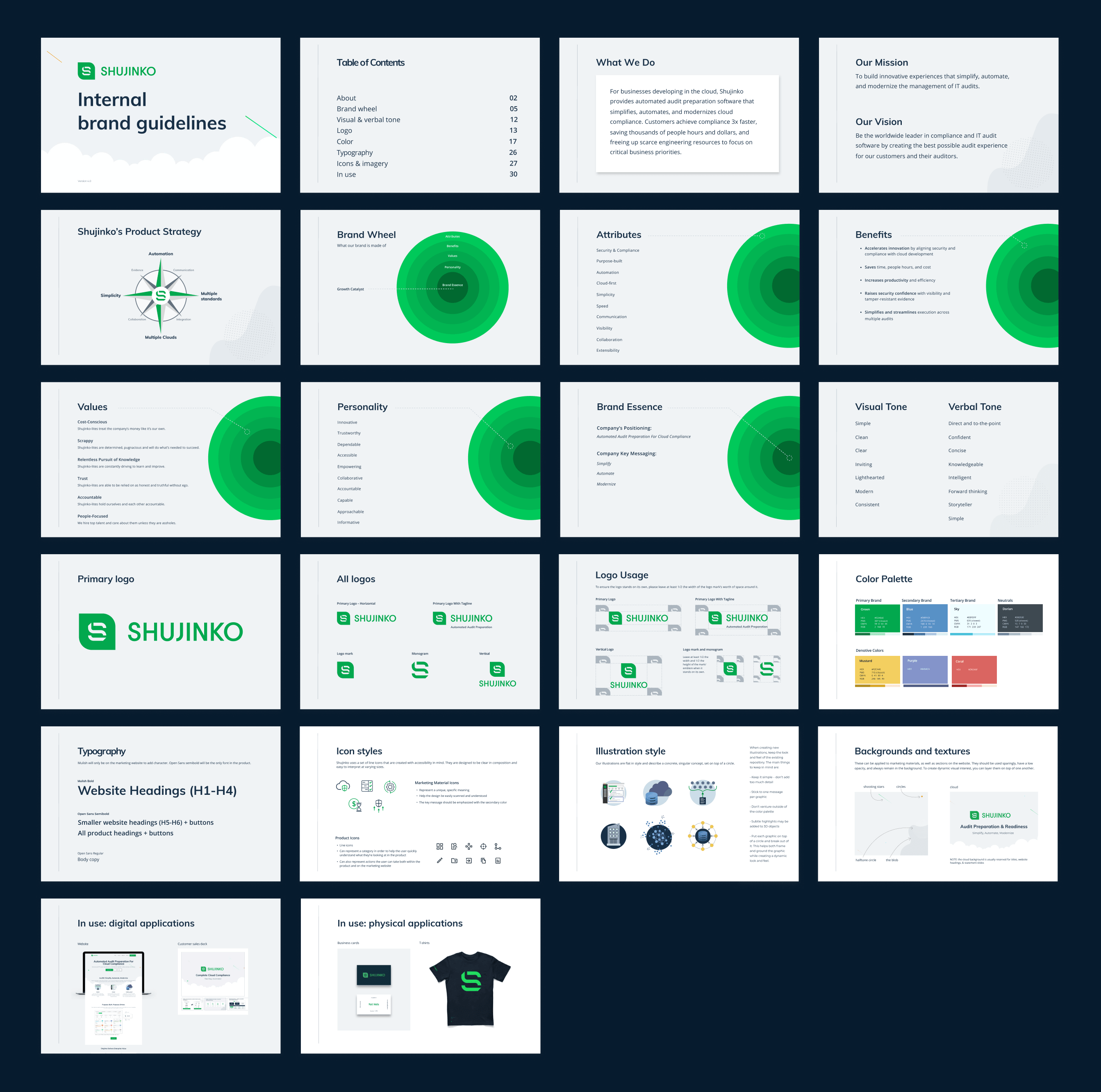
I also collaborated with leadership to expand their brand guidelines. I refined their color palette and defined illustration and icon styles. Two versions of brand guidelines were made: one was external-facing that could be handed to agencies and another that was internal, where the company strategy and brand wheel was included. I also created a design system in figma specifically for product work.
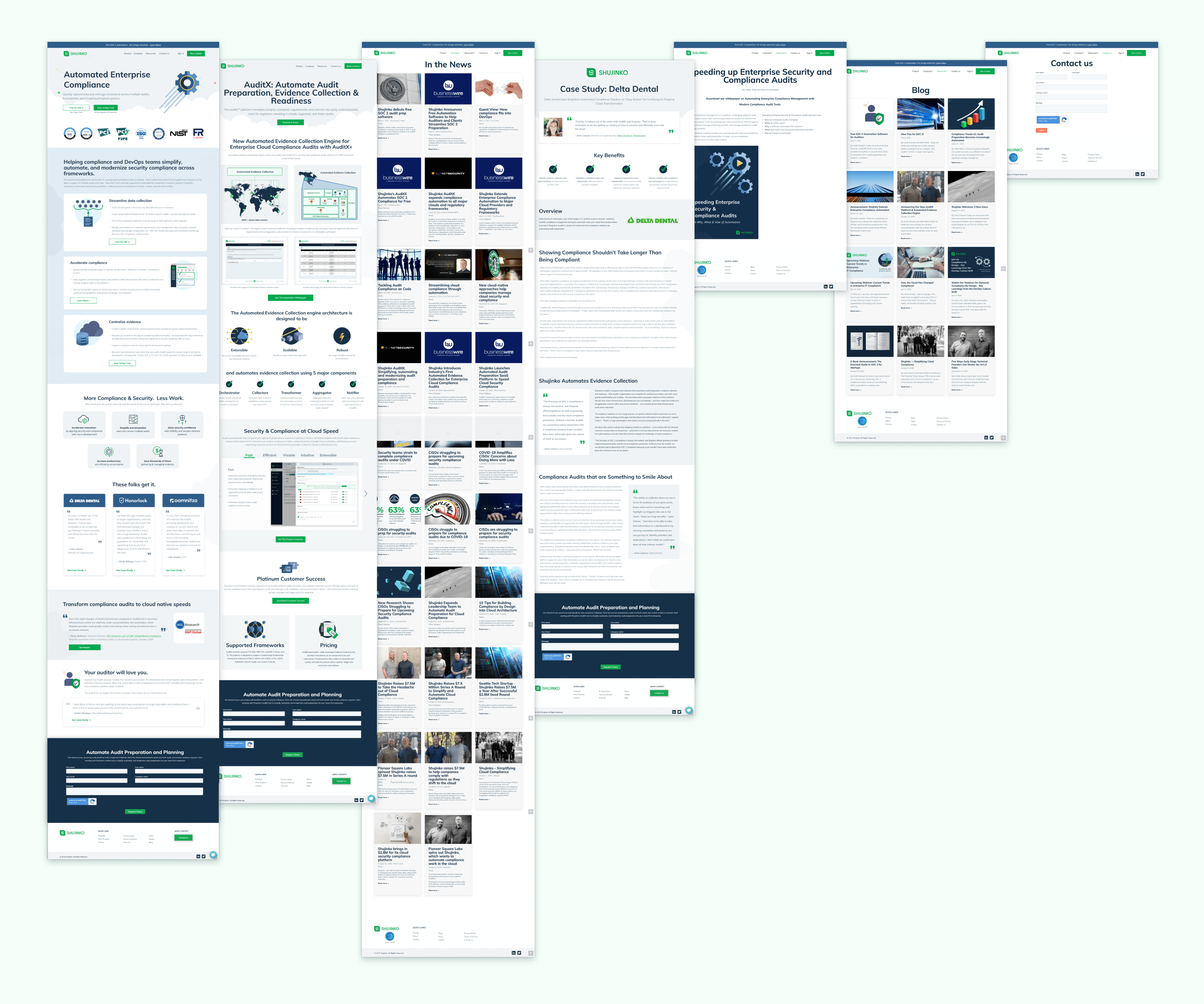
Along with working on Shujinko's branding, I updated their marketing website to fit their business pivot, as well as designed the graphics for and laid out whitepapers, ebooks, and printable materials.
Want to Work Together?
Fantastic! Hit the button below to get started.
